¶ What is the Visualisation Studio?
The Visualisation Studio is a custom DHIS2 application used to create interactive and dynamic dashboards that display visualisations of data from multiple sources. It gives you a great deal of flexibility in how you structure the layout of your dashboards and also how you customise the look and feel of your visualizations through their chart properties.
¶ Why the visualisation studio?
The visualisation studio was birthed after a series of iterations of creating custom DHIS2 application for projects that required dashboards that display various visualizations for real-time data. The DHIS2 Data Visualizer application typically displays data from analytics and that does not account for new data that comes in after a successful analytics run. In such scenarios, you need a tool that gives you data beyond that from the analytics tables.
Additional inspirations that led to the development of the visualisation studio include:
- The need to support additional data sources beyond DHIS2
- The need to auto refresh dashboard visualisations without manually refreshing the entire dashboard
- The need to customise the dashboard layout to the user's preference
- Flexibility to customise the chart properties for each visualisation
- Supporting more visualisations / charts
- Printing and emailing a dashboard to managers
- Displaying dashboards on smart Tvs / displays
¶ Features
The visualisation studio provides:
- An intuitive interface for crafting interactive dashboards
- suppports fixed sized dasboards and dynamically changing dashboards
- Advanced filtering for the data in your datasets
- A variety of beautiful charts to visualize your datasets
- Ability to customize chart properties to your like and feel
- Seamless, in-memory asynchronous caching and queries
¶ Technology Stack
¶ Installing
¶ Administrators Guide
This section targets users with permissions to create dashboards and all the other objects that make up a dashboard. The administrative users are those that can create craft the dashbords including all the customisations for the items displayed on the dashboards.
¶ Additional Configuration after Installation
Once you have successfully installed the visualisation studio, you need to assign some permissions to user roles in oder to determine those that will have access to the administrative side of the application and those that will only have view access for the created dashboars.
¶ Key Concepts
- Data Source
- Category
- Visualisation Query
- Indicator
- Visualisation
- Dashboard
- Section
- Visualisation properties
- Filters
¶ Data Sources
The data visualized in the visualisation studio is either from the DHIS2 instance where it is installed or from external sources that include but not limited to:
- Other DHIS2 instances
- RESTful APIs
- Elasticsearch
Defining a data source is mandatory for creating dashboards and is usually the very first step to creating dashboards. The Data Sources page gives the ability to create, modify, view and delete a data source.
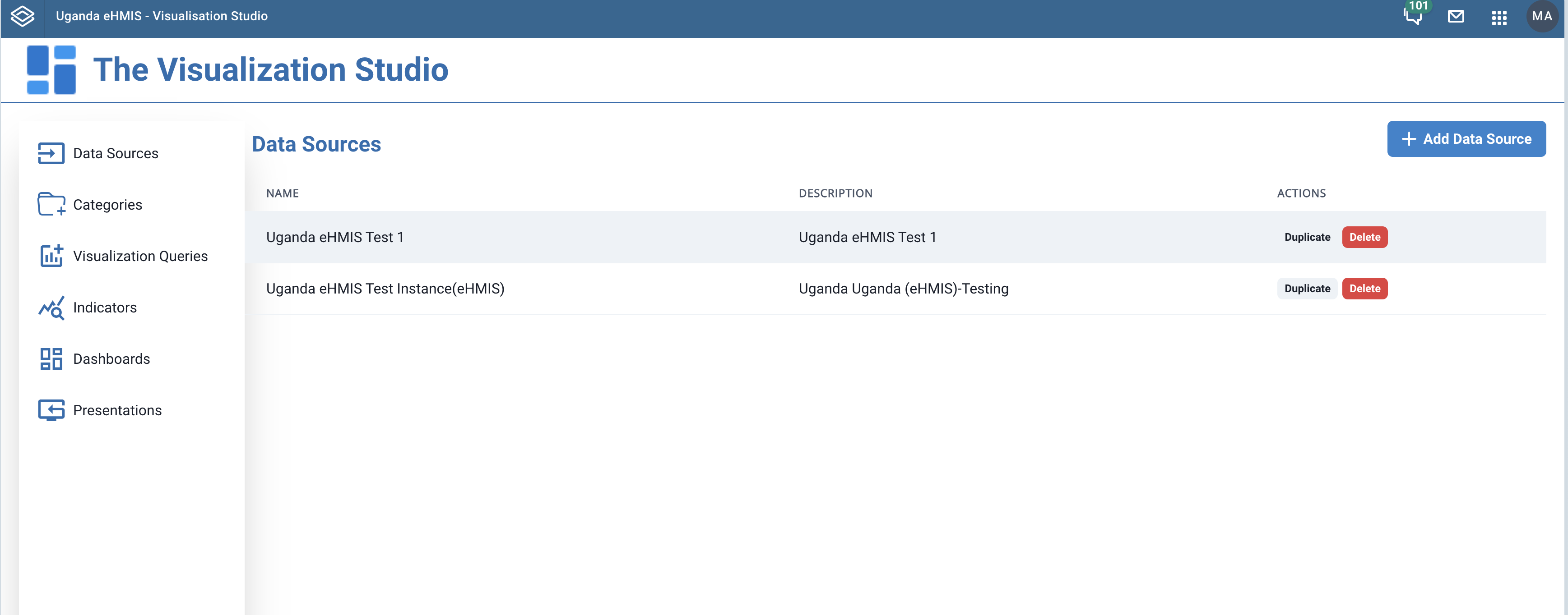
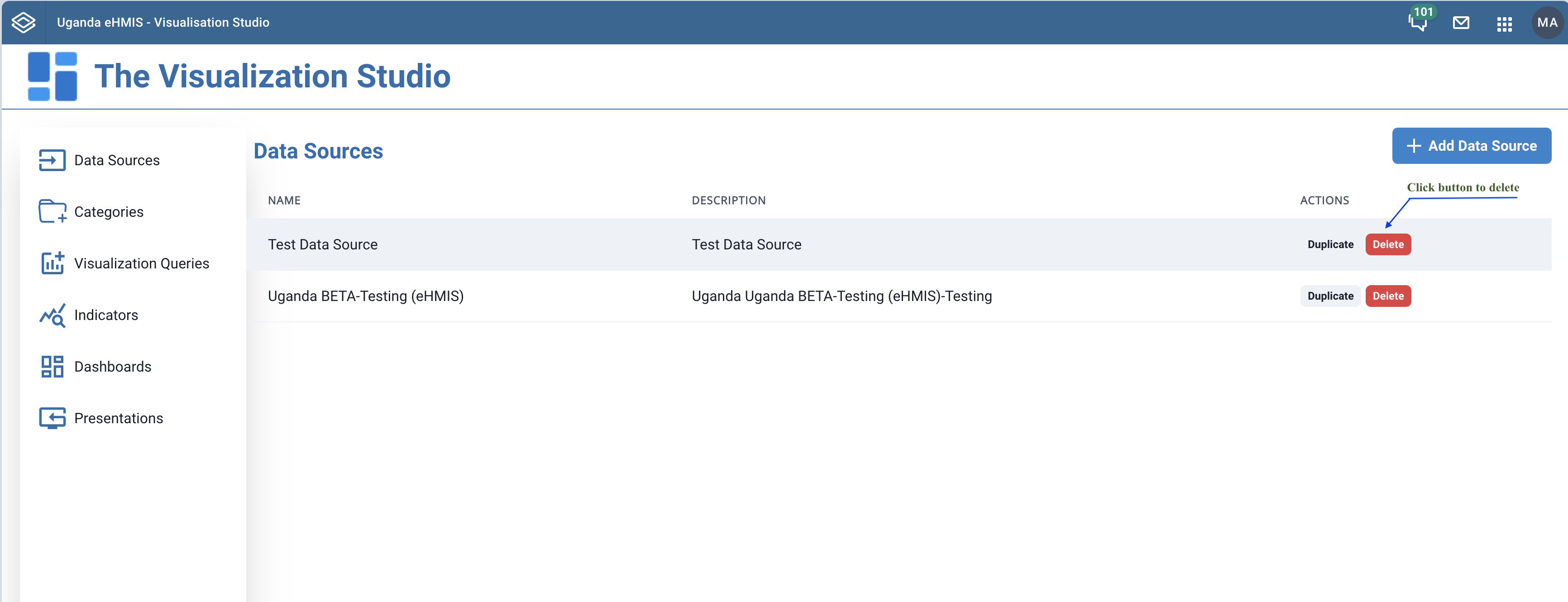
Clicking the Data Sources link in the left navigation bar will result in displaying of a listing of the previously created data sources in the content area of the page.
 |
|---|
| Listing of data sources |
At the top right of the listing is a + Add Data Source button that leads you to a form to create a new data source.
At the top right of the listing is a + Add Data Source button. Clicking this button that leads you to a form to create a new data source.
|
|---|
| Listing of data sources |
 |
|---|
| New data source form |
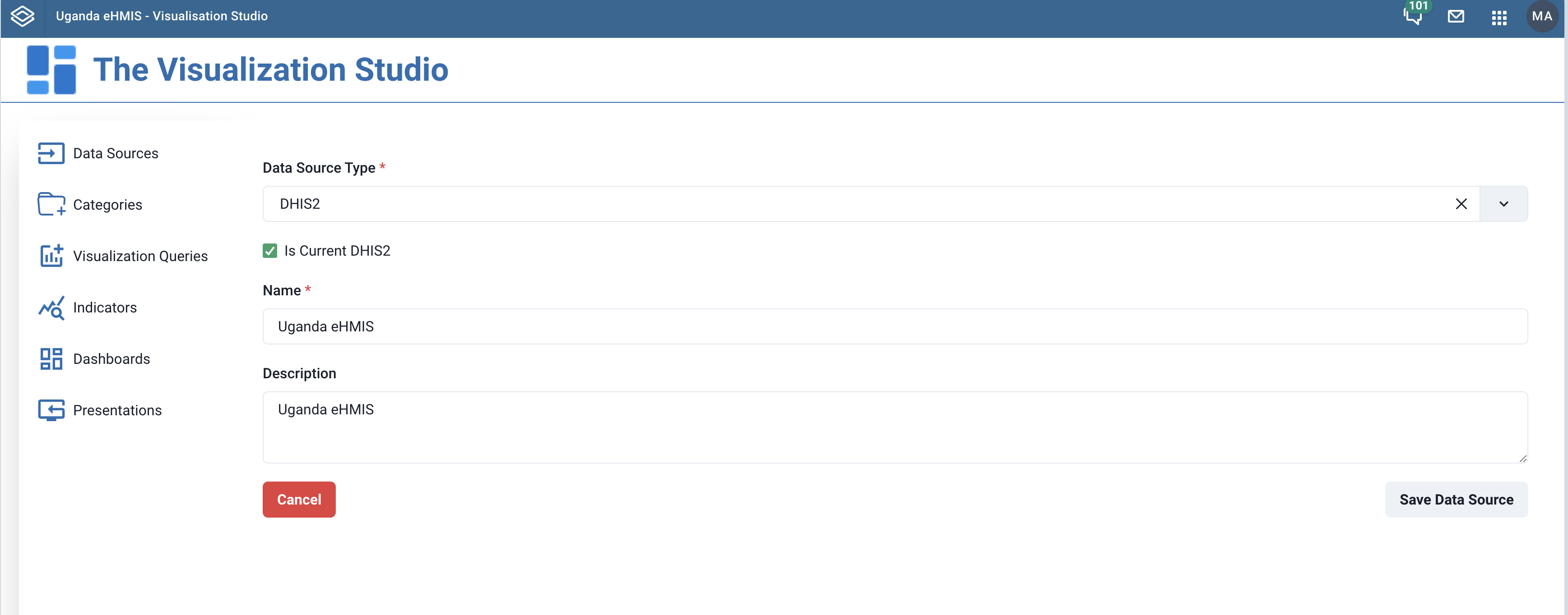
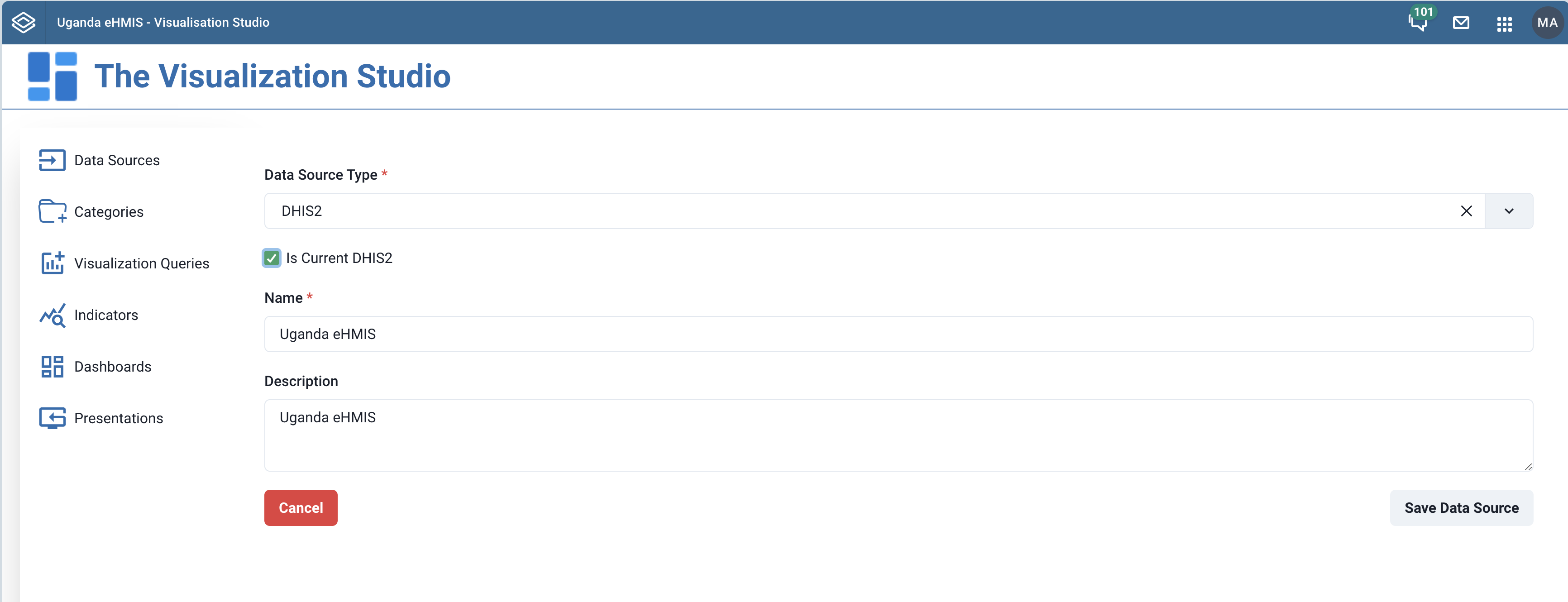
In the form, you specify:
- Data Source Type: One of DHIS2, API or Elasticsearch
- Is Current DHIS 2: When checked, this sets the current DHIS 2 instance as the data source
- Name: The name of the data source
- Description: The description for the data source
- URL: The URL for an external DHIS 2 instance, if not using the current one
- Username: The username for the user in DHIS 2 instance to use as data source
- Password: The password for the user in the DHIS 2 instance used as data source
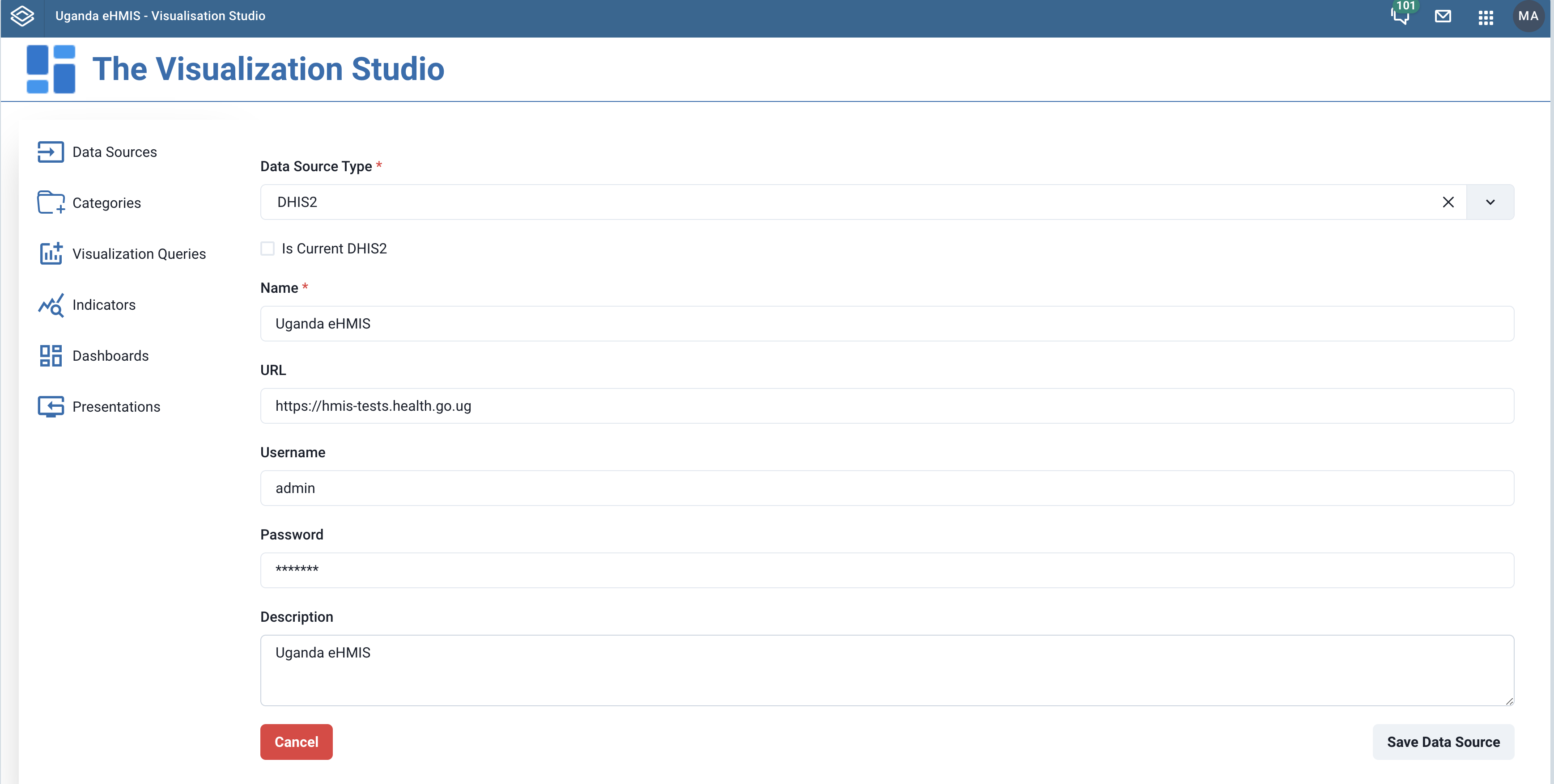 |
|---|
| Additional fields for external data source |
After providing the above information in the form, you hit the Save Data Source button to save. This will then lead you to a listing of the saved data sources, which should include the previously added one.
To modify a previously saved data source, click on the name of the data source in the data source listing. This will bring up a pre-populated form like that used when adding a data source.
 |
|---|
| Click data source name to edit |
Make the necessary modifications in the form and the click the Save Data Source button.
 |
|---|
| Editing a data source |
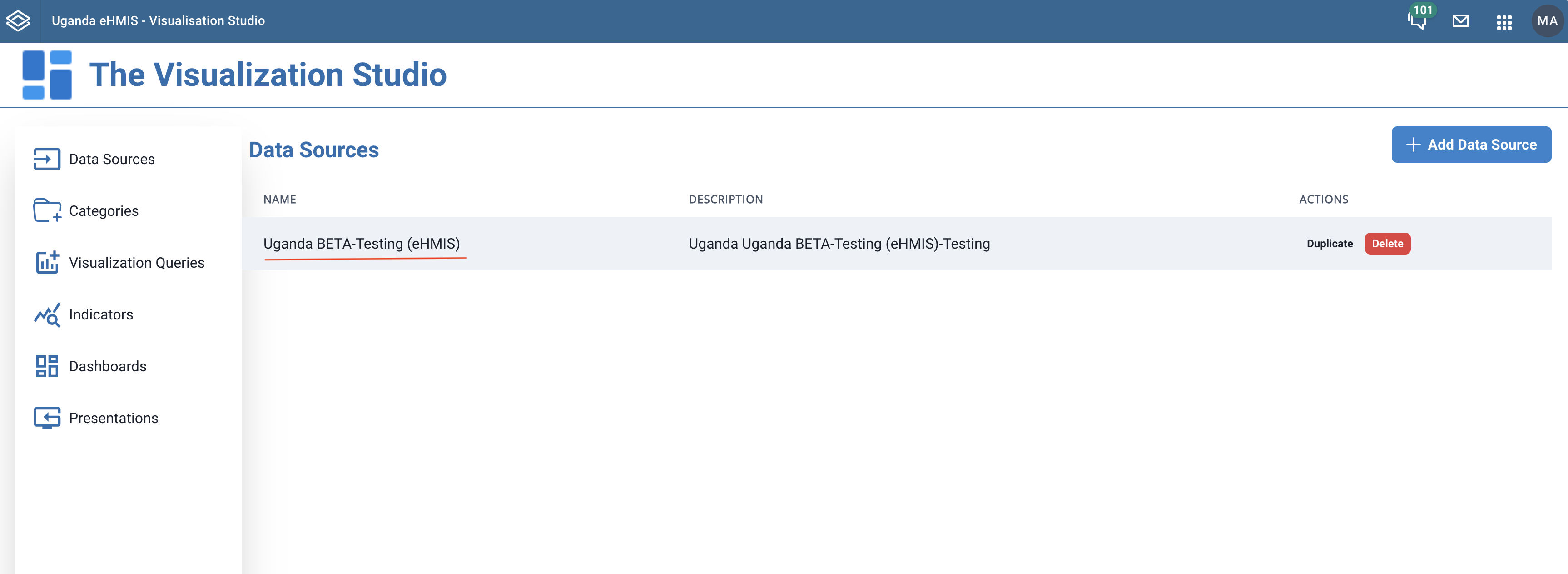
To delete a data source, you click the Delete button in the row corresponding to the data source in the listing.
 |
|---|
| Deleting a data source |
¶ Visualisation Queries
Visualisation queries define a way data is obtained from your data source. Each data source has ways in which data can be extracted if one intends to generated visualisation out of it. The visualisation studio focuses on i) the analytics API, ii) SQL Views, iii) custom APIs an iv) DHIS2 visualisations as the ways to expose data for building visualisations. Thus, visualisation queries are away to consume DHIS2 analytics, SQL views, or APIs from your data source to create a dataset your charts, maps and other visualisations will be generated from.
¶ Viewing and searching visualisation queries
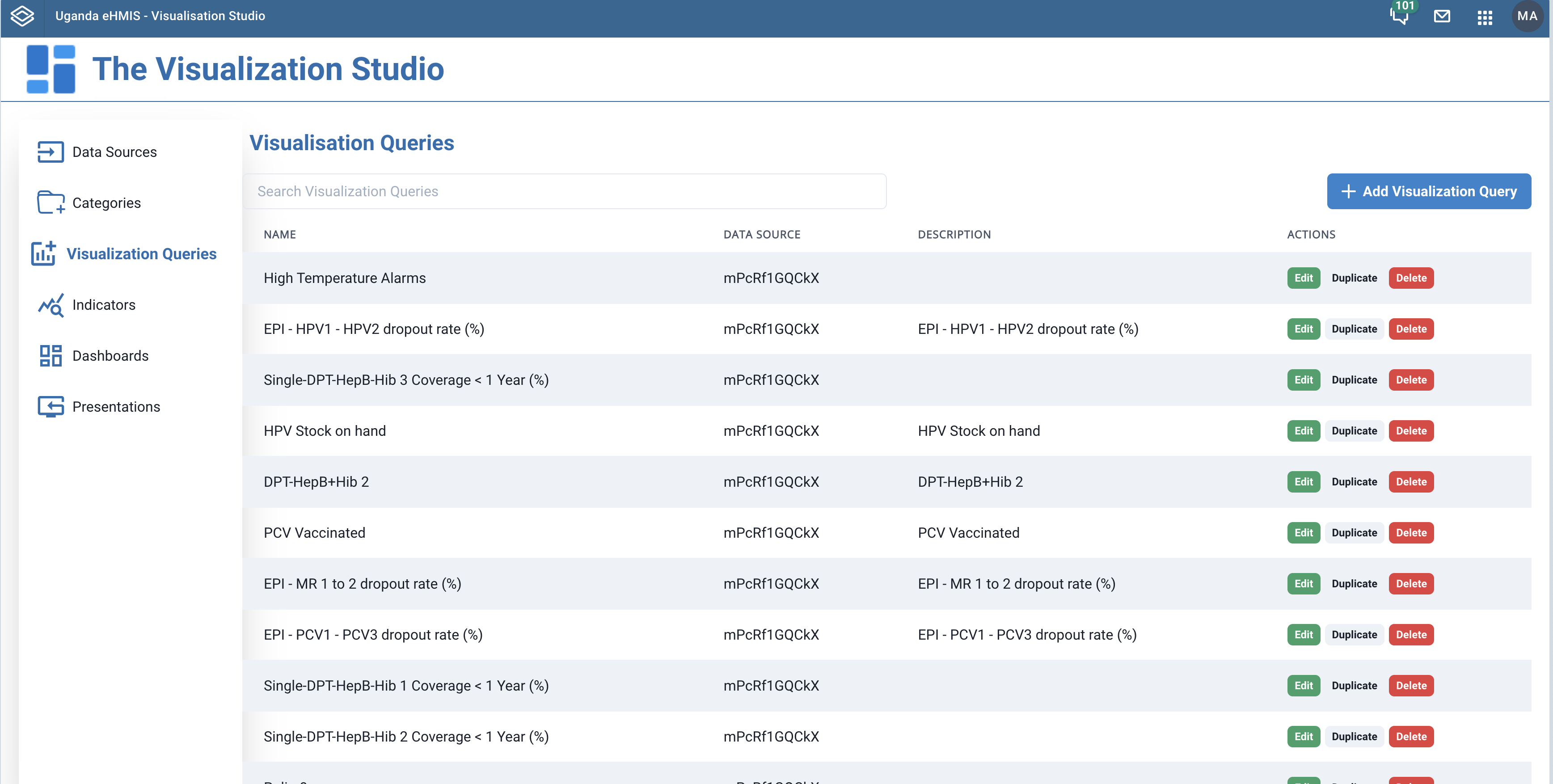
Click the Visualisation Queries link in the left side bar menu to navigate to the list of your previously created visualisation queries.
 |
|---|
| Listing of visualisation queries |
You can search through your visualisation queries using the search entry right above the listing. Typing in the etry should filter out the visualisation queries with name or description mathing the seaerch term.
 |
|---|
| Searching visualisation queries |
¶ Creating Visualisation Queries
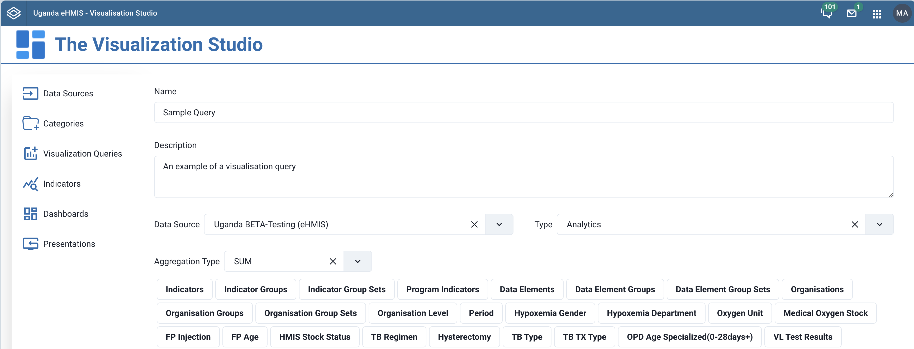
To create a visualization query, click the + Add Visualization Query button at the top right of the visualization queries page. This should bring up a form for you capture the fields that define the visualization query.
The screenshot below shows part of the form for creating a visualization query.
 |
|---|
| New visualisation query form |
 |
|---|
| New visualisation query form |
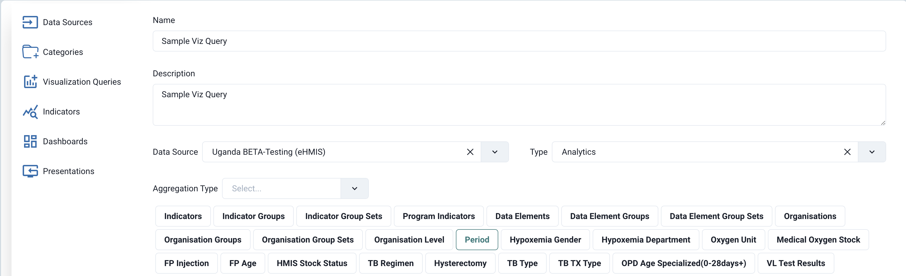
In the form you specify:
| Field Name | Required | Description |
|---|---|---|
| Name | Yes | The name given to the visualization query |
| Description | No | A description for the visualization query |
| Data Source | Yes | The data source to be used |
| Data Source Type | Yes | The data source type. Analytics | SQL Views | API | DHIS2 Visualizations |
| Aggregation Type | Yes (if using analtics) | Aggregation type to use in the aggregation process. SUM | AVERAGE | AVERAGE_SUM_ORG_UNIT | LAST | LAST_AVERAGE_ORG_UNIT | COUNT | STDDEV | VARIANCE | MIN | MAX |
| Analytics Dimensions | Yes (if using analytics) | When using analytics from your data source, you will be presented with analytics dimensions that feature the data that forms part of the dataset of the visualisation queries. These analytics dimensions can be Data Elements, Data Element Groups, Data Eelement Groups Sets, Oganisaton Units, Organisation Unit Groups, Organisation Unit Group Sets, Organisation Unit Levels, Periods, Indicators, Indicator Groups, Program Indicators, among other dimensions |
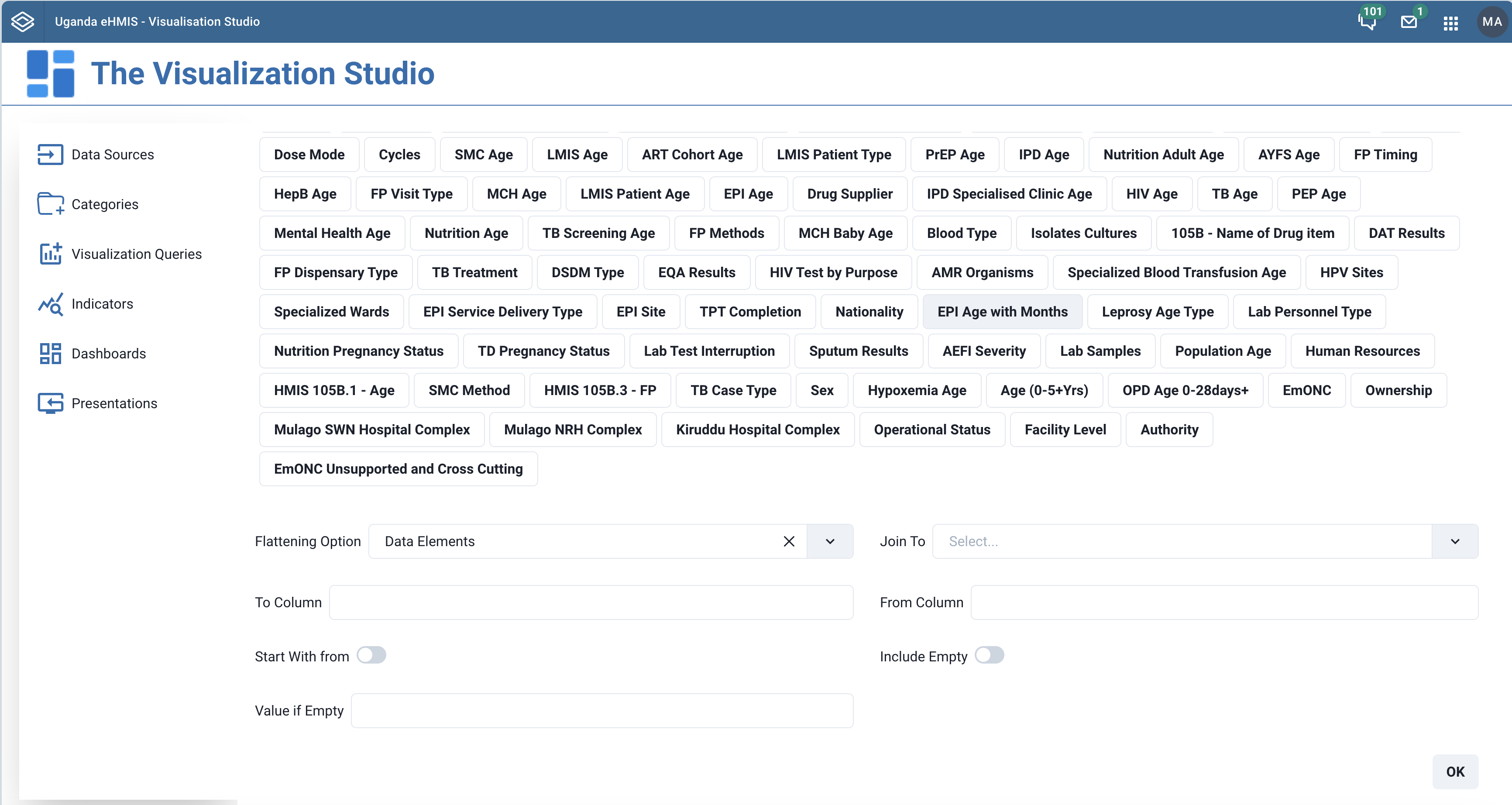
| Flattening Options | No | Falttening options are a way to dig deep in the nested objects (such as attributes) in your dimensions and then flatten the their values to create a record of values. In essense you make a flat table including the values deeply nested in the dimensions |
| Join To | No | The visualisation query which you want to connect the one being created with when creating a relationship between the two. |
| To Column | No | The field in the visualisation query which you want to associate with another in the visualization being created |
| From Column | No | The field in the visualization query being created that you want to match with the To Column field in the visualization query forming the relationship. |
| Start With From | No | Whether to start with data in the From Colum when making the relationship |
| Include Empty | No | Whether to include empty values when joining data for two visualizations. This is helpful if you want them to appear but assign a default value |
| Value If Empty | No | The default value of fields that are found empty |
¶ Adding dimensions to the visualisation query
Note
The analytics-based visualisations require to define dimensions your visualisation will show.
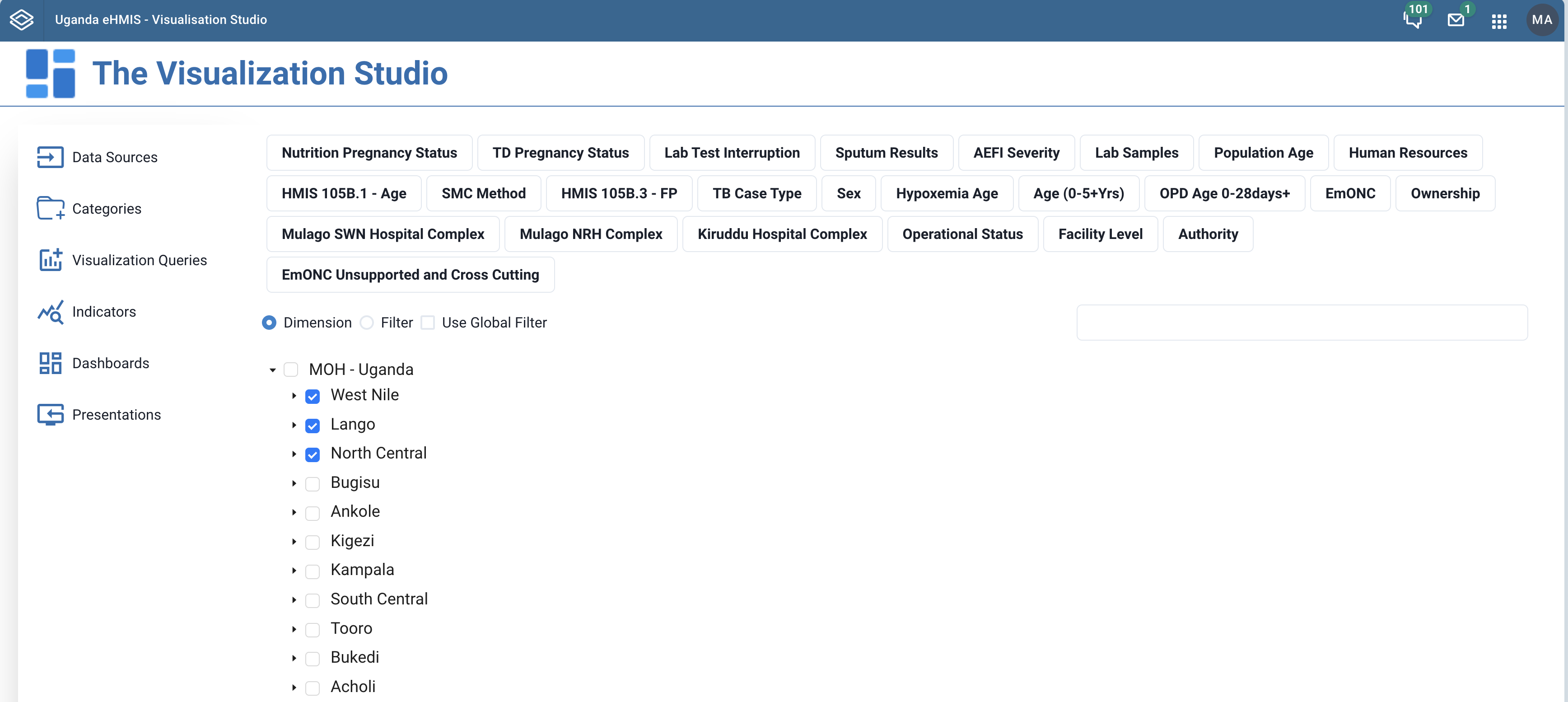
When creating visualisation queries from the analytics-based data source, you must specify which dimensions you want the visualisations to show. Therefore, you should specify the data, period and organisation unit dimensions when creating a visualisation query.
A listing of dimensions to choose from is provided in the form for creating the visualisation query. Pay attentioin to the following main dimensions:
- Data: Includes data elements, indicators and datasets (reporting rates), describing the phenomena or event of the data.
- Periods: Describes when the event took place.
- Organisation units: Describes where the event took place.
When you add a dimension to your visualisation query, you then must specify what it shall be considered as:
- A dimension - to be included as part of the analytics query
- A filter - dimensions that will not be part of the query response content, and that the aggregated values in the response will be collapsed on the filter dimensions
- A Global filter - the filter that will be applied to the entire dashboard
To add a period dimension to the definition of your visualizatioin query, select Period in the list of the analytics dimensions. The selected dimension will be highlighted like in the screenshot below.
 |
|---|
| Select period dimension |
A period selector will be displayed in the form for you to select the periods you want to use. Clicking on a period takes it to the list of selected periods. Likewise, clicking a selected period removes it from the list. You can also switch between using the periods as a dimension or a filter.
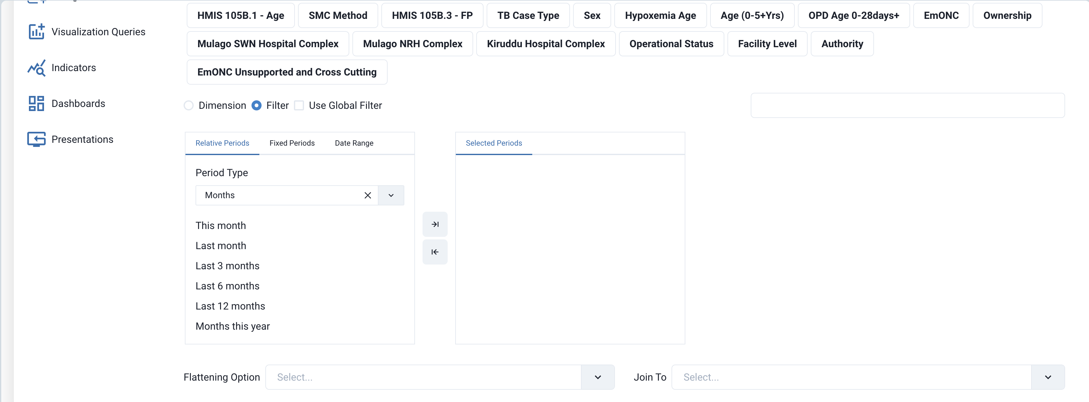 |
|---|
| Period dimension selector |
The period selector support relative periods, fixed periods and date ranges that can be used as period filters or dimensions in the analytics call to retrieve content for the visualisation. The screenshot below shows the use of a data range in the period selector.
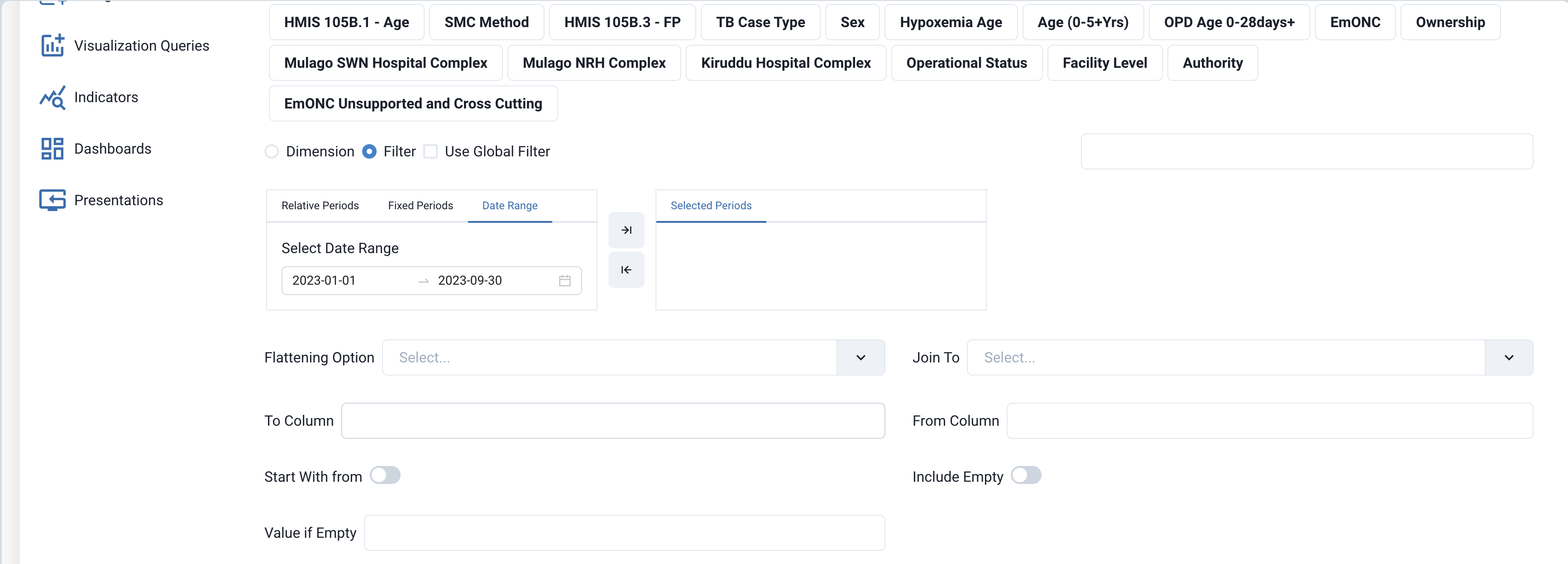 |
|---|
| Selecting data range in period selector |
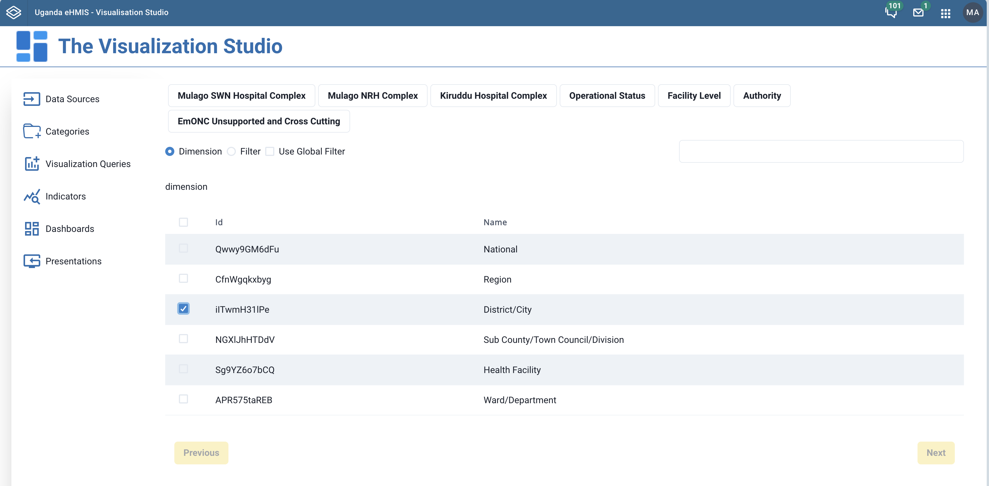
The available dimensions relating to organisation units are Organisations, Organisation Groups, Organisation Group Sets, and Organisation Level. Clicking any one of these dimensions will add to the form a list of the dimension's records to pick from and add to your visualization query.
The screehshot below show the oganisation unit tree select filed with organisation to select when the organisatoin dimension is chosen.
 |
|---|
| Organisation Unit dimension |
The screehshot below show the list of organisation unit levels to add to your visualisation query from when the Organisatoin Level dimension is chosen.
 |
|---|
| Organisation Level dimension |
The screehshot below show the list of organisation unit groups to add to your visualisation query from when the Organisatoin Group dimension is chosen.
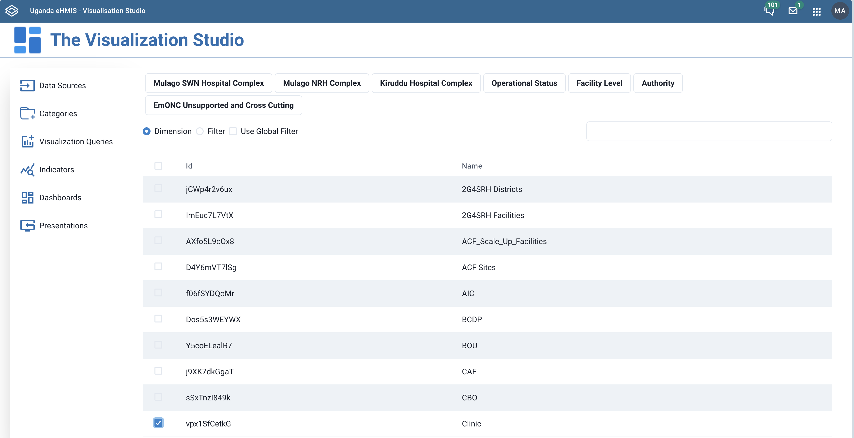 |
|---|
| Organisation Group dimension |
Always remember to specify if the dimension is to used as an analytics filter or a data dimension.
¶ Other dimensions
Note
You must specify at least one data dimension
When targeting map visualisations, you should add an Organisation Unit Level dimension
You must specify at least one period as dimension or filter
¶ Indicators
An indicator is a combination of one or two visualisation queries, one being the numerator and the other the denominator. If only one visualisation query is used to define the indicator, the denominator defaults to 1. Because of the need to visualize data from multiple data sources - which also implies multiple DHIS2 instances, it is possible to have the indicator's numerator to be from one data sorce and the denominator from another.
An indicator can also be created from an expression (formula) that includes the numerator and denominator. If we let the numerator to be X and the denominator Y, then and indictor can be crafted from a valid mathematical expression involving X and Y, for example 2X * Y.
Please not that both the Numerator and Denominator are visualisaton queries.
¶ Viewing, creating, editing and deleting indicators
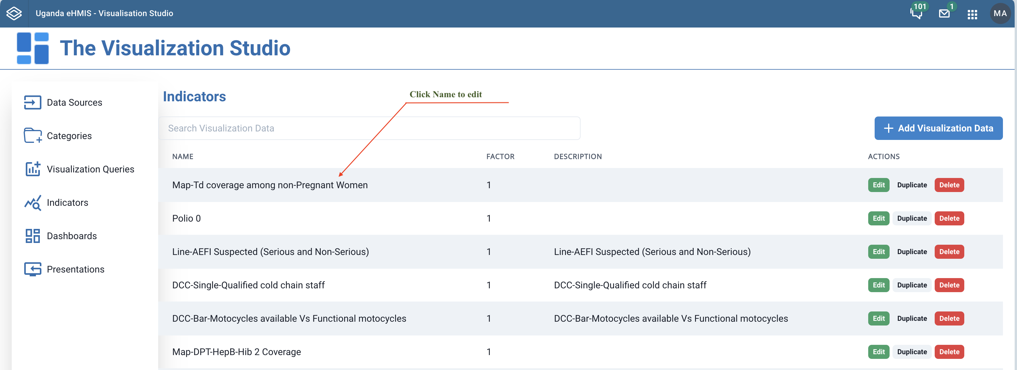
Click the Indicators link in the left navigation bar to display of a listing of the previously created indicators in the content area of the page. You can also search through your existing indicators by typing in the search entry right above the listing.
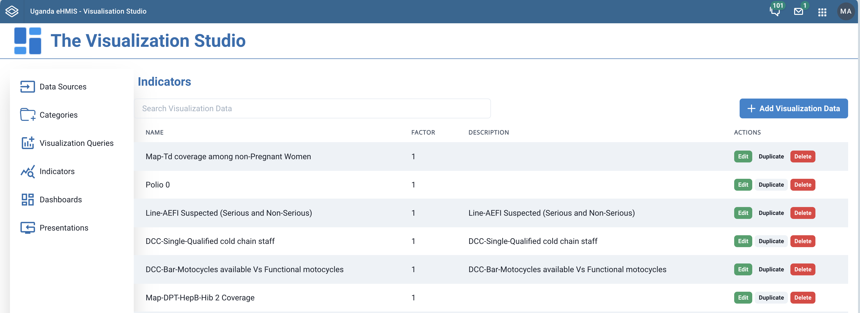 |
|---|
| Listing of indicators |
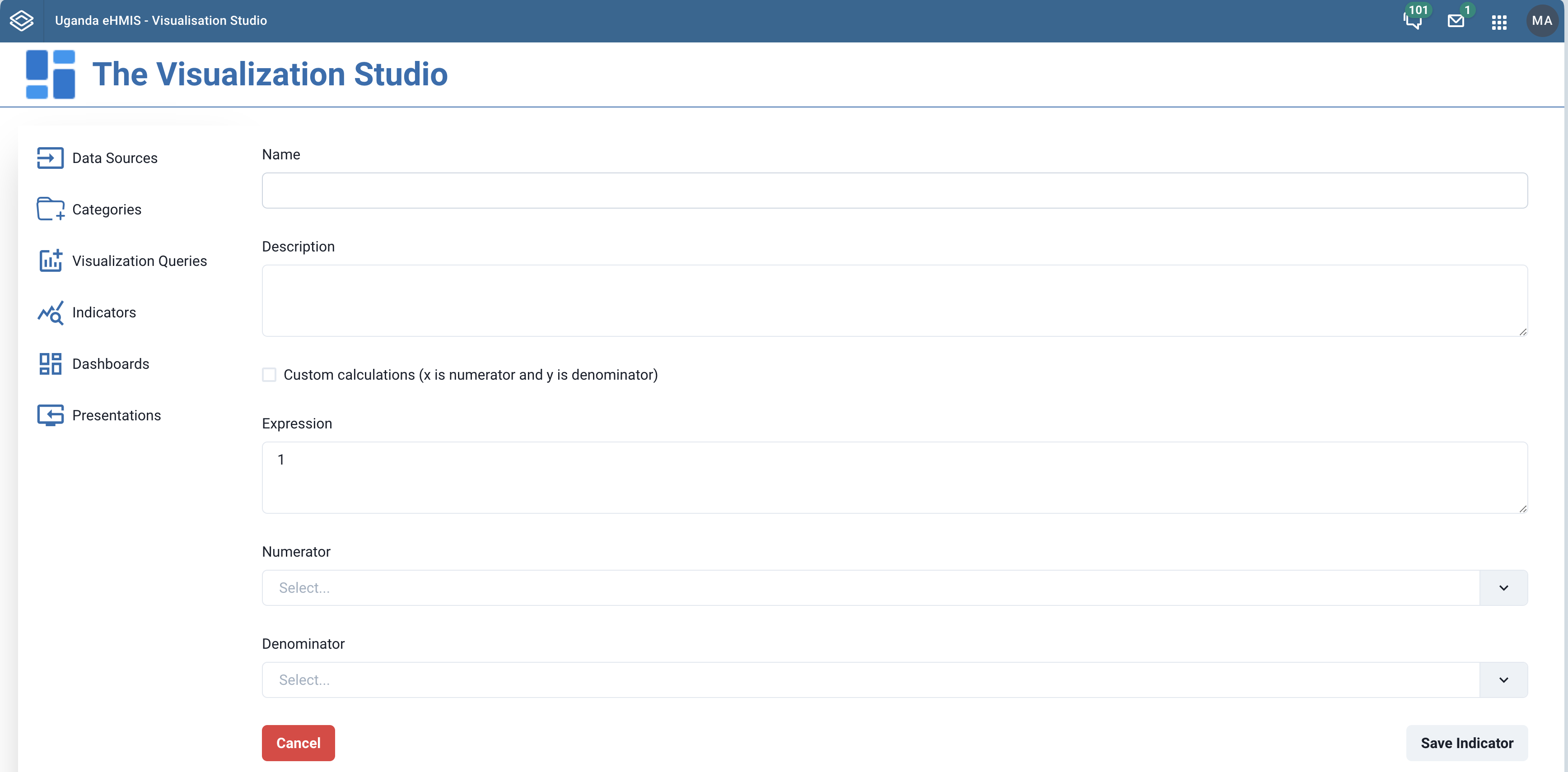
To create a new indicator, + Add Visualization Data button at the top right of the Categories page. Clicking this button that leads you to a form to create a new category.
 |
|---|
| Form for creating an indicator |
To create an indicator, define:
- Name: The name of the indicator
- Description: A description for the indicator
- Custom Calculation: Specify if the indicator is to be derived from a custom expression
- Expression: A custom expression involving a Numerator and Denominator that is used to derive the indicator
- Numerator: Since the indicator is envisaged to be a fraction (N/D), The data visulaisation query used as the numerator of the faction.
- Denominator: The visualisation query used as the denominator. If not specified, defaults to 1
Once you provide all the required fields in the form, click the Save indicator button to create the indicator.
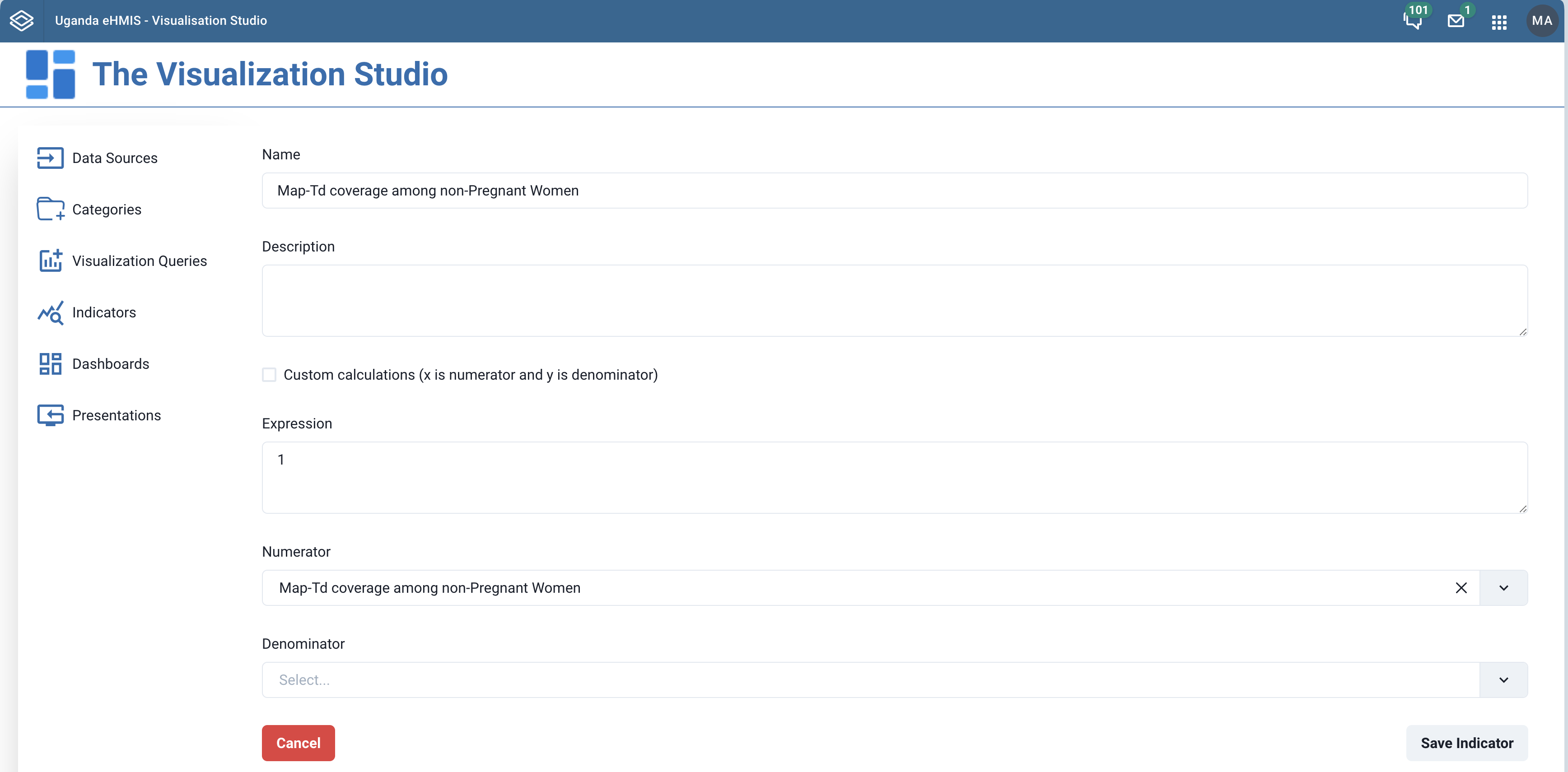
To modify a previously saved indicator, click on the name of the indicator or the Edit button in the row corresponding to the indicator in listing. This will bring up a pre-populated form like that used when adding a indicator.
 |
|---|
| Click name to edit indicator |
Make the necessary modifications in the form and the click the Save Indicator button.
 |
|---|
| Editing indicator |
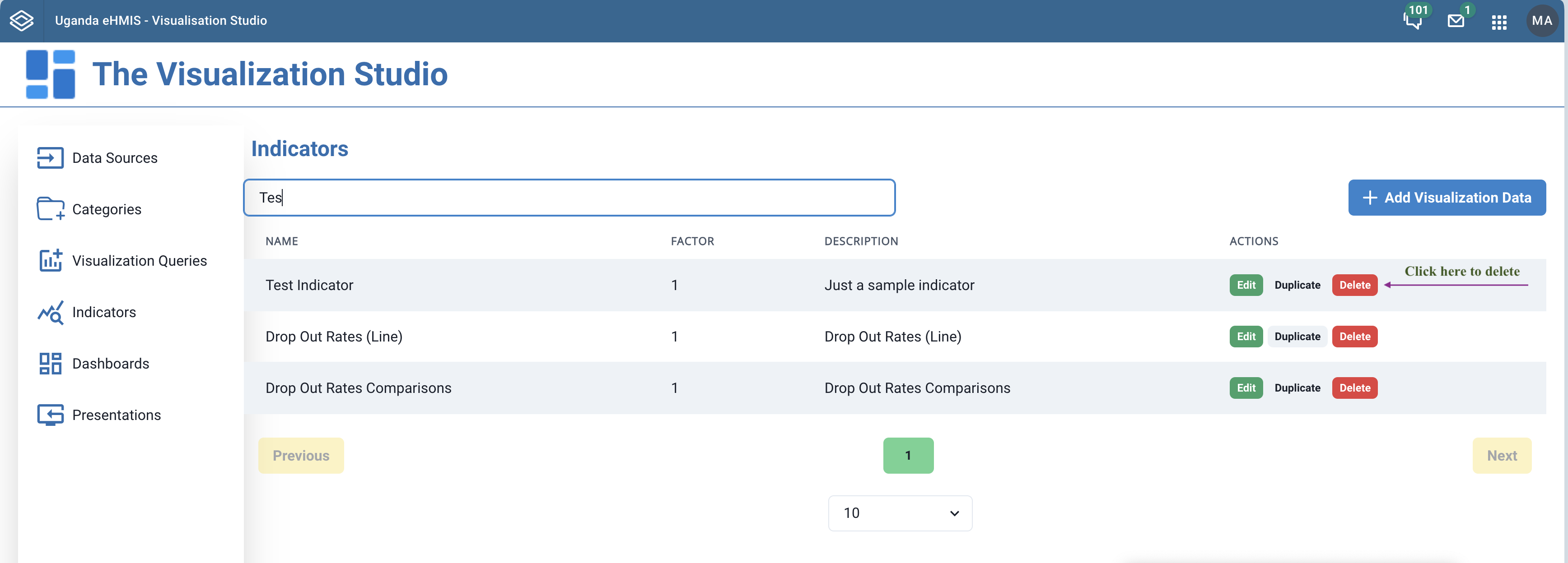
To delete an indicator, you click the Delete button in the row corresponding to the indicator in the listing.
 |
|---|
| Deleting an indicator |
¶ Categories
Categories are a way to group your dashbords created with the visualisation studio. A category may have one or more related dashboards - and the relationship could be a programme area, a functional area or any other grouping criterion.
¶ Viewing, creating, modifying and deleting categories
Click the Categories link in the left navigation bar to display of a listing of the previously created categories in the content area of the page.
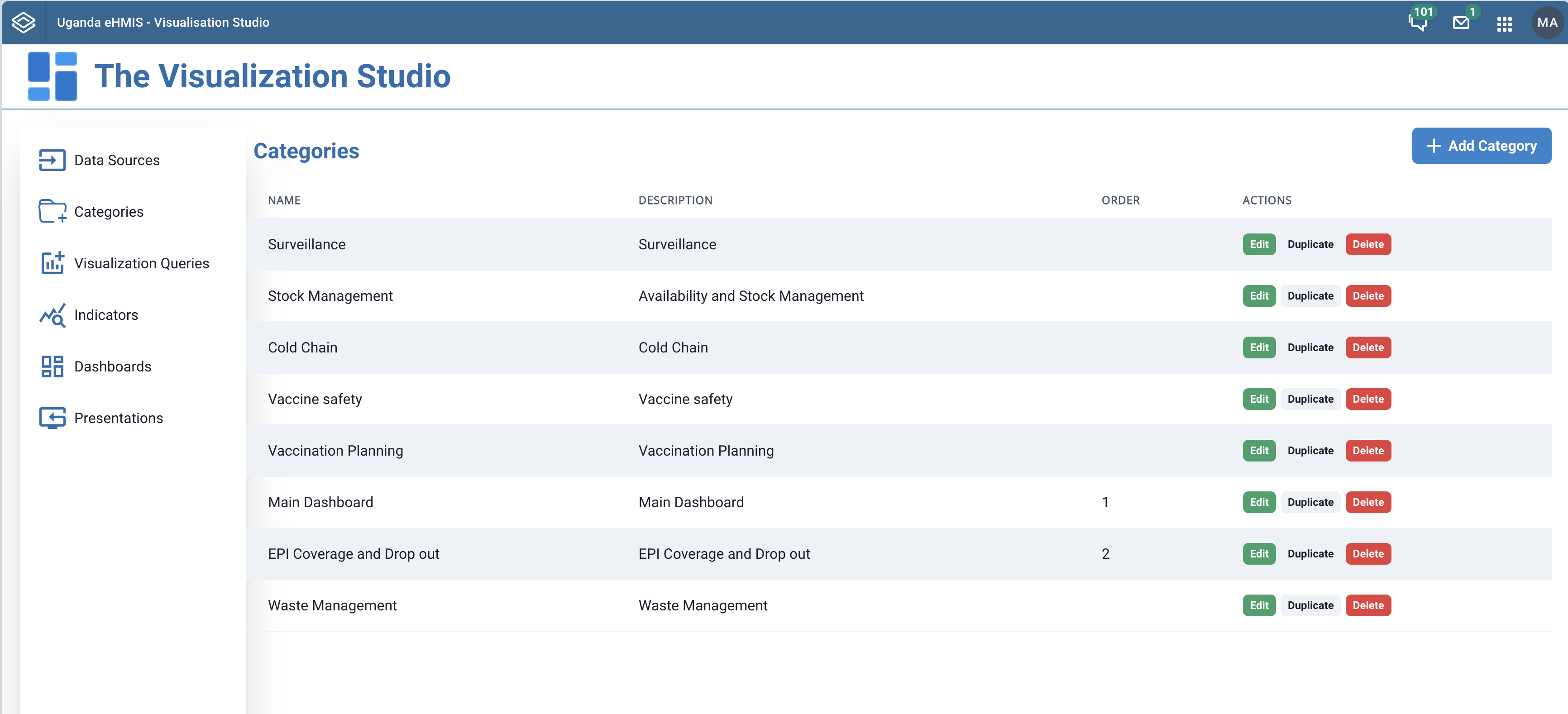 |
|---|
| Listing of categories |
To create a new category, + Add Category button at the top right of the Categories page. Clicking this button that leads you to a form to create a new category.
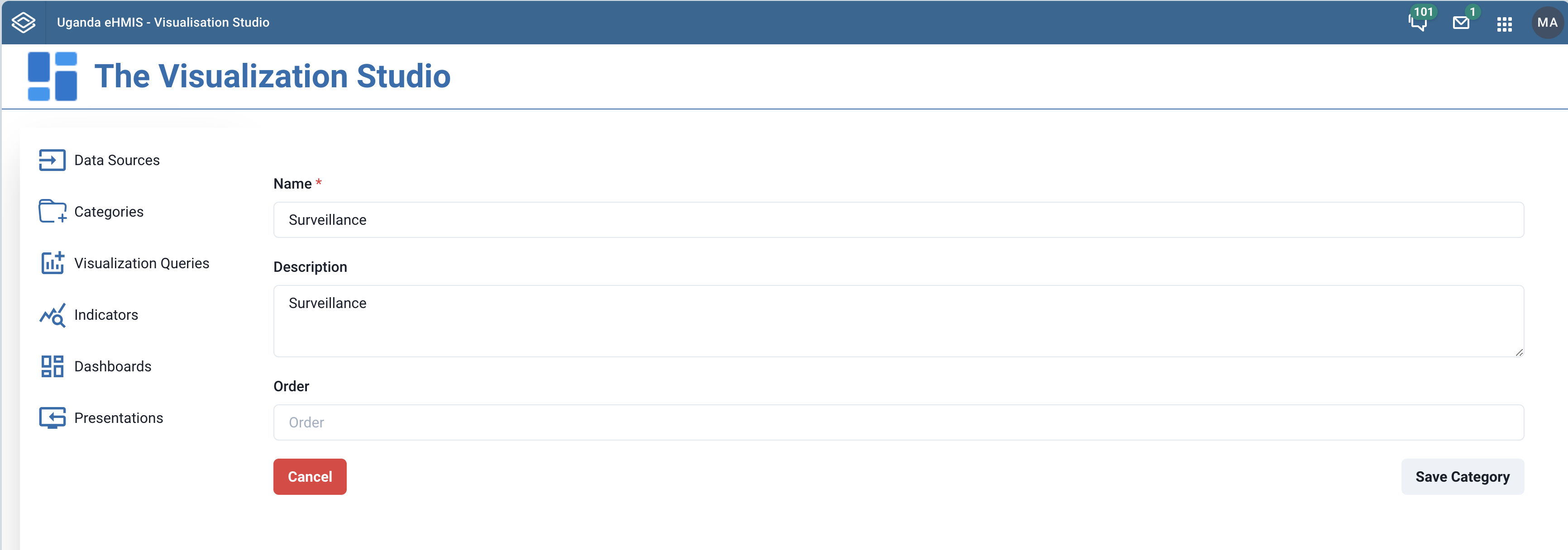 |
|---|
| Form for creating category |
To modify a previously saved category, click on the name of the category or the Edit button in the row corresponding to the category in listing. This will bring up a pre-populated form like that used when adding a category.
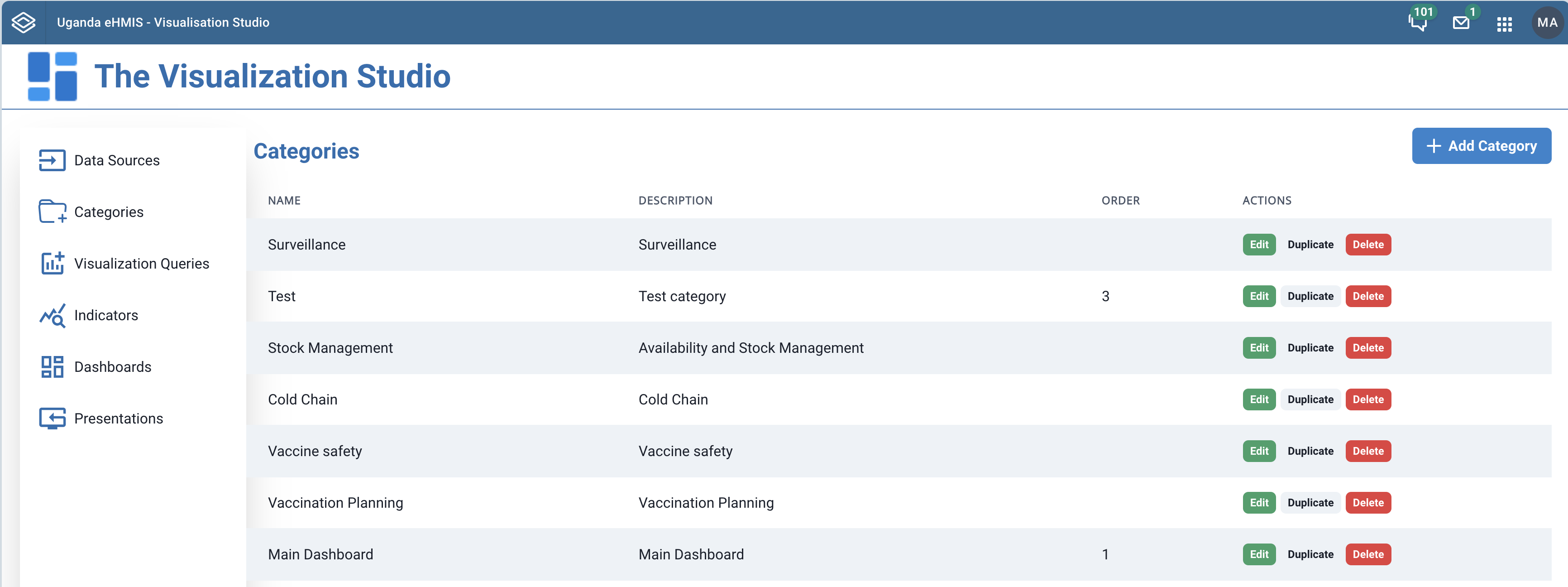 |
|---|
| Click name to edit category |
Make the necessary modifications in the form and the click the Save Category button.
|
|---|
| Editing category |
To delete a category, you click the Delete button in the row corresponding to the category in the listing.
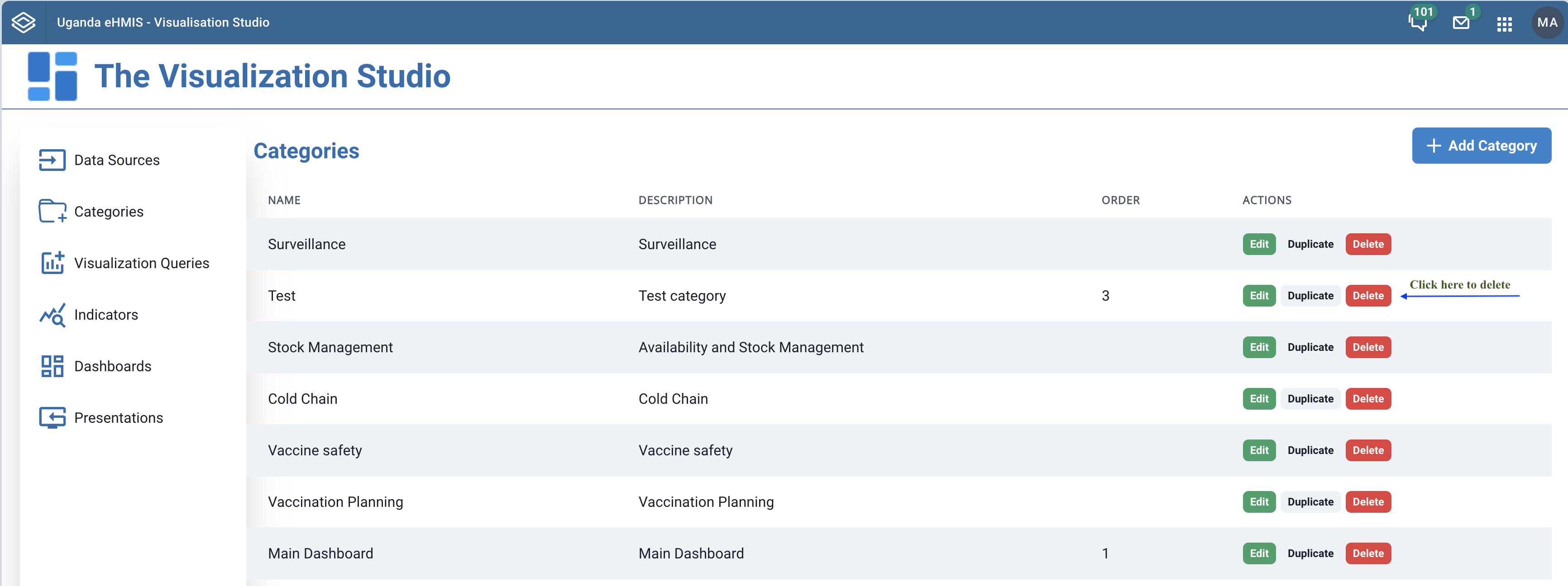 |
|---|
| Deleting a category |
¶ Dashboards
Dashboards are a graphical representation of a collection of visualisation items such as maps, charts, reports, pivot tables that give a comprehensive overview of your data. The Visualisation studio aims at putting together various visualisations and then add them to a dashboard where they can be viewed by users.
¶ Types of dashboards
There are two kinds of dashboards supported in the Studio. The kind is determined by how sections are laid out on the dashboard. Fixed sized sections are those where the number of columns and rows ocuppied on the dashboard are predetermined when designing the dashboard. The dynamic sections on the other hand can be dragged and dropped around when designing the dashboard.
A Fixed dashboard is a dashboard whose contents fit in the viewable area of the web browser without the need to scroll.
A fixed dashboard is defined by how many columns and rows it consumes. The default being 24 columns and 24 rows.
A Dynamic dashboard is a dashboard whose contents may go beyond the viewable area of the web browser. In otherwords, it can be scrolled to view contents extending beyond the viewport.
A template dashboard is a special kind of dashboard whose contents you want to appear on each of your dashboards. This is useful for things like navigation menus that you want appear on each dashboard.
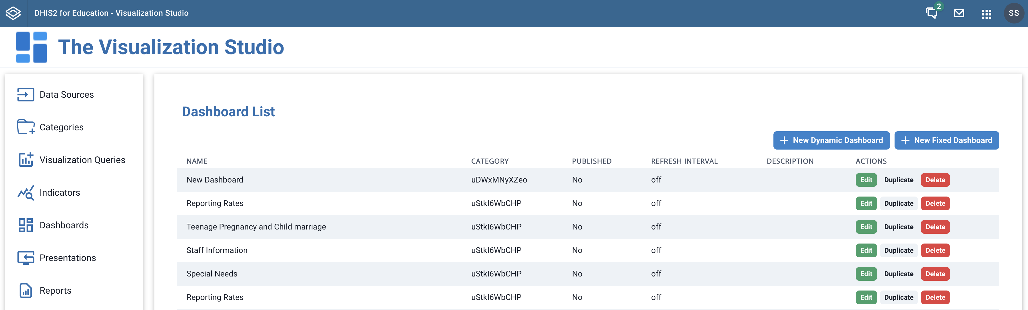
¶ Creating dashboards
When you access the Dashboards page, you will see a list of previously created dashboards. If there are none created yet, there are two buttons, + New Dynamic Dashboard and + New Fixed Dashboard at the top right of the content area of the page. Click the button corresponding to the type of dashboard you want to create.
 |
|---|
| Dashboards |
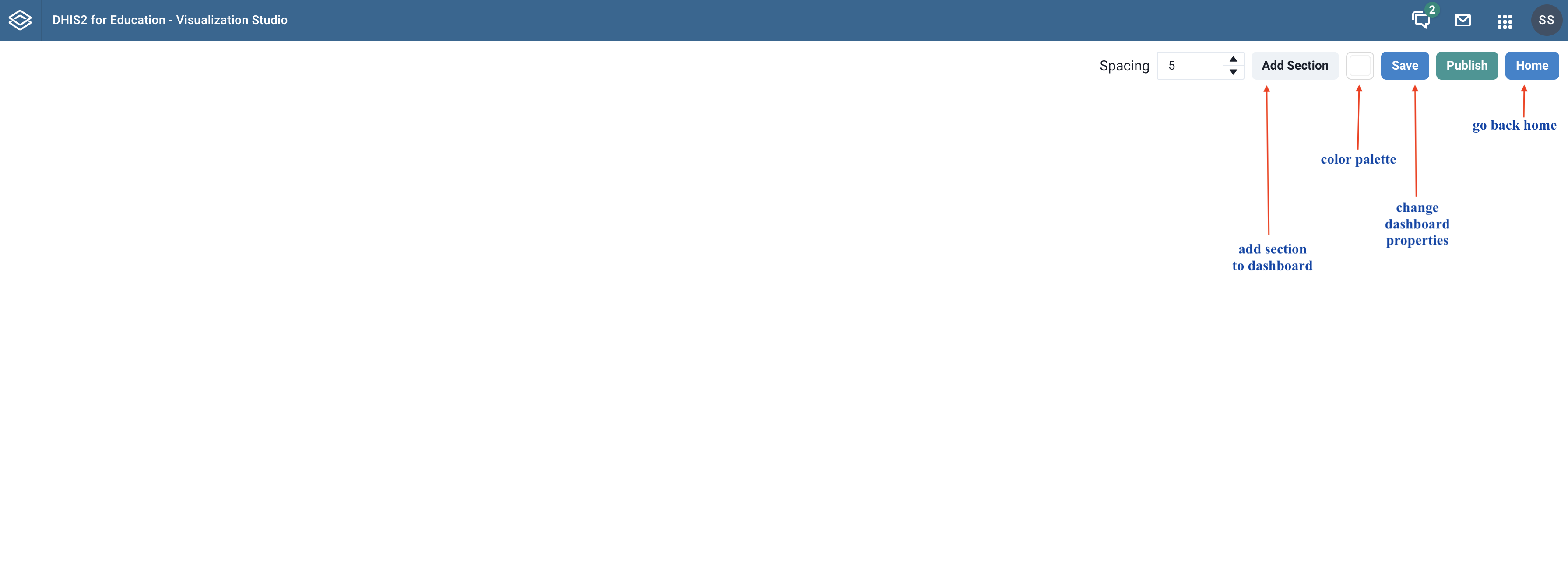
After clicking the button to create the type of dashboard you want, a new blank dashboard is created. At the top right of the blank dashboard are buttons / controls to help you change some configurations about the new dashboard.
 |
|---|
| New Dashboard |
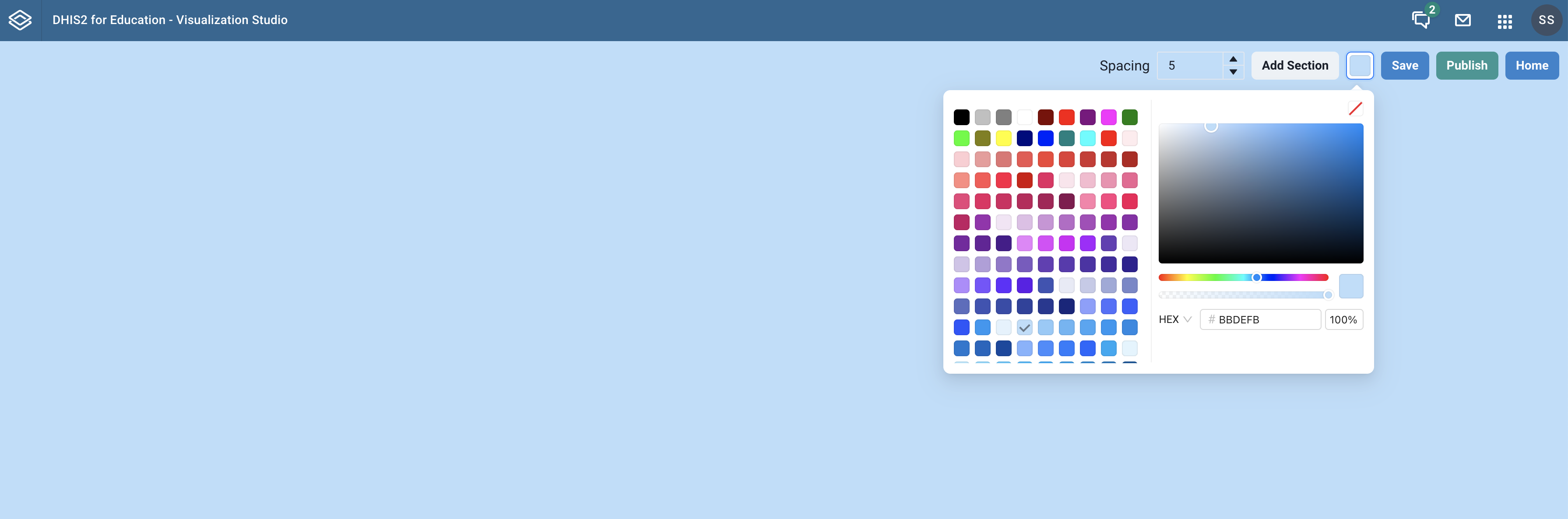
If you wish to change the background color of your dashboard, you can use the color palette to selct a color of your choice.
 |
|---|
| Setting dashboard background color |
The new blank dashbord will only be saved when you click the Save button. This leads to a modal where you set some dashboard properties like the name, category among others before the dashboard can be saved.
 |
|---|
| New dashboard properties |
¶ Sections
All the items you add to your dashboard are placed in what we call a section.
A section can have one or more visualisations
The sections have either a fixed size or they can be resized by dragging and dropping.
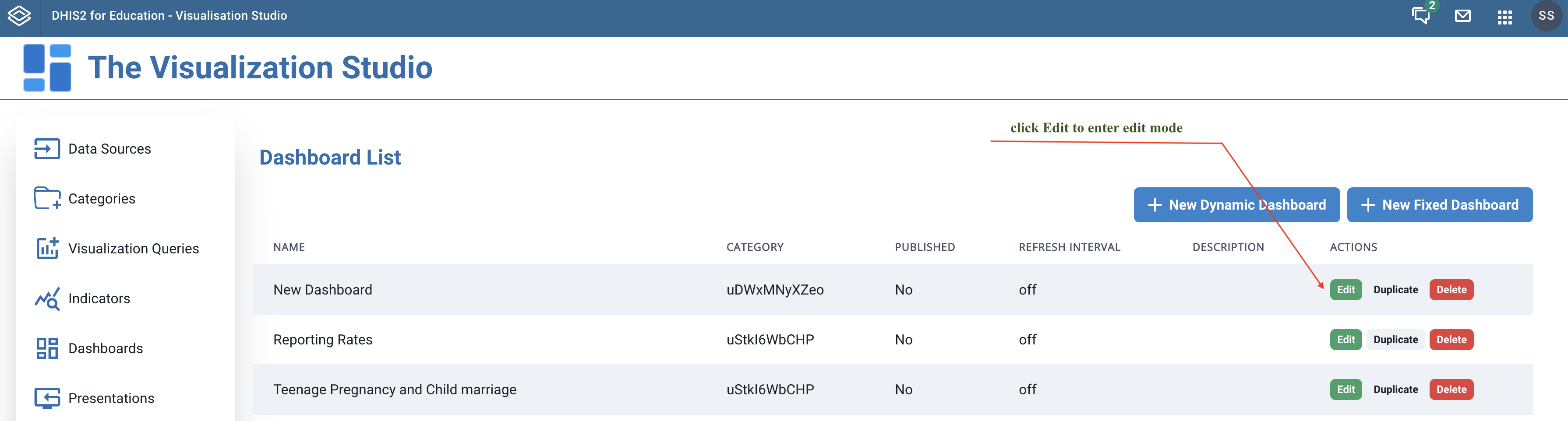
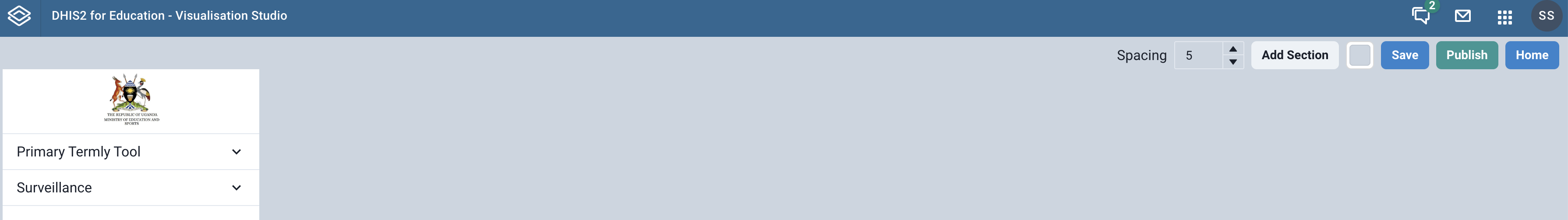
To create a section, you have to navigate to a dashboard where you intend to add the section and enter edit mode by clicking the Edit button.
 |
|---|
| Dashboard list - how to enter edit mode |
Once in edit mode of your dashboard, click the Add Section button at the top right of the page.
 |
|---|
| Dashboard Edit Mode |
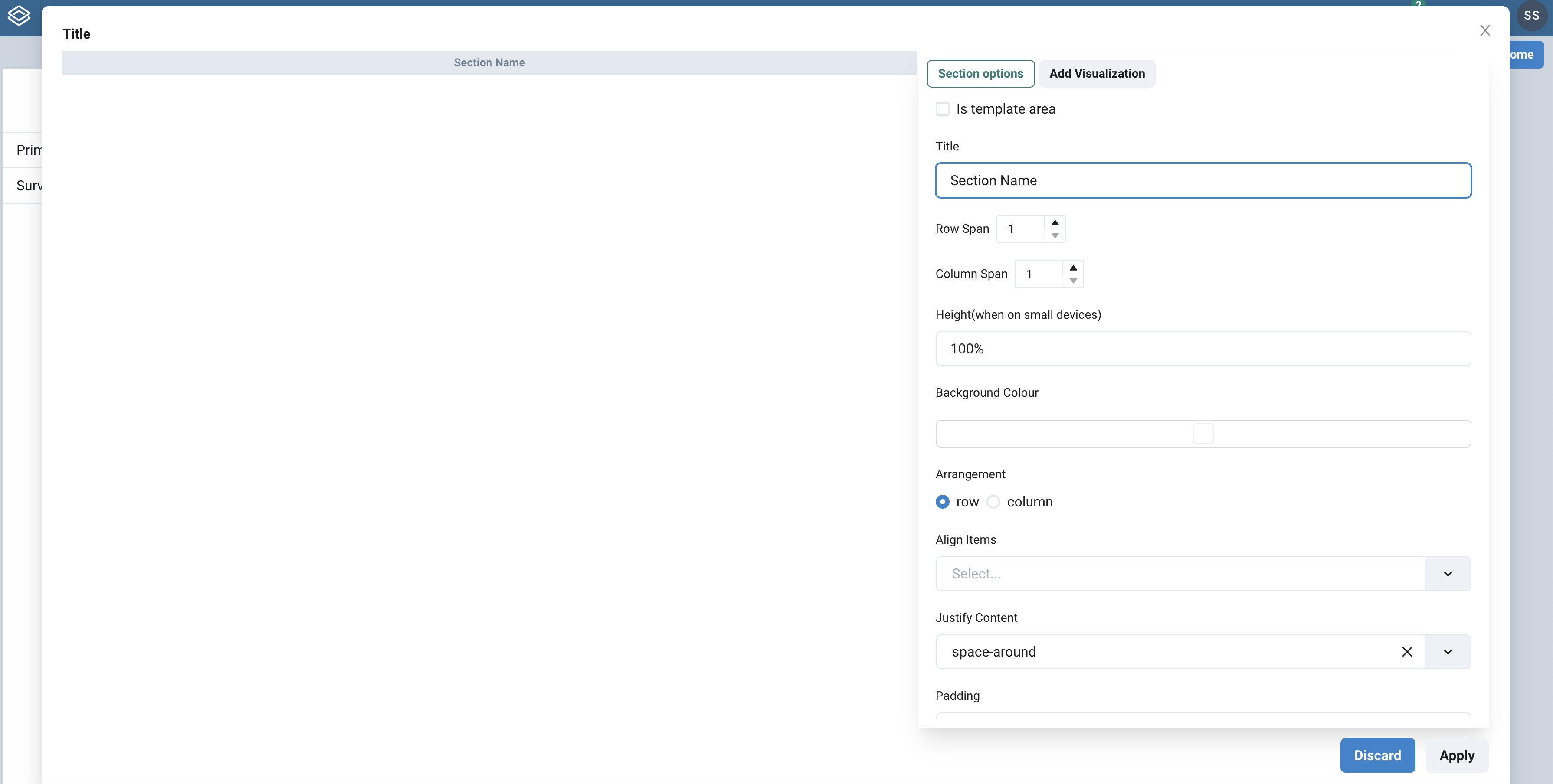
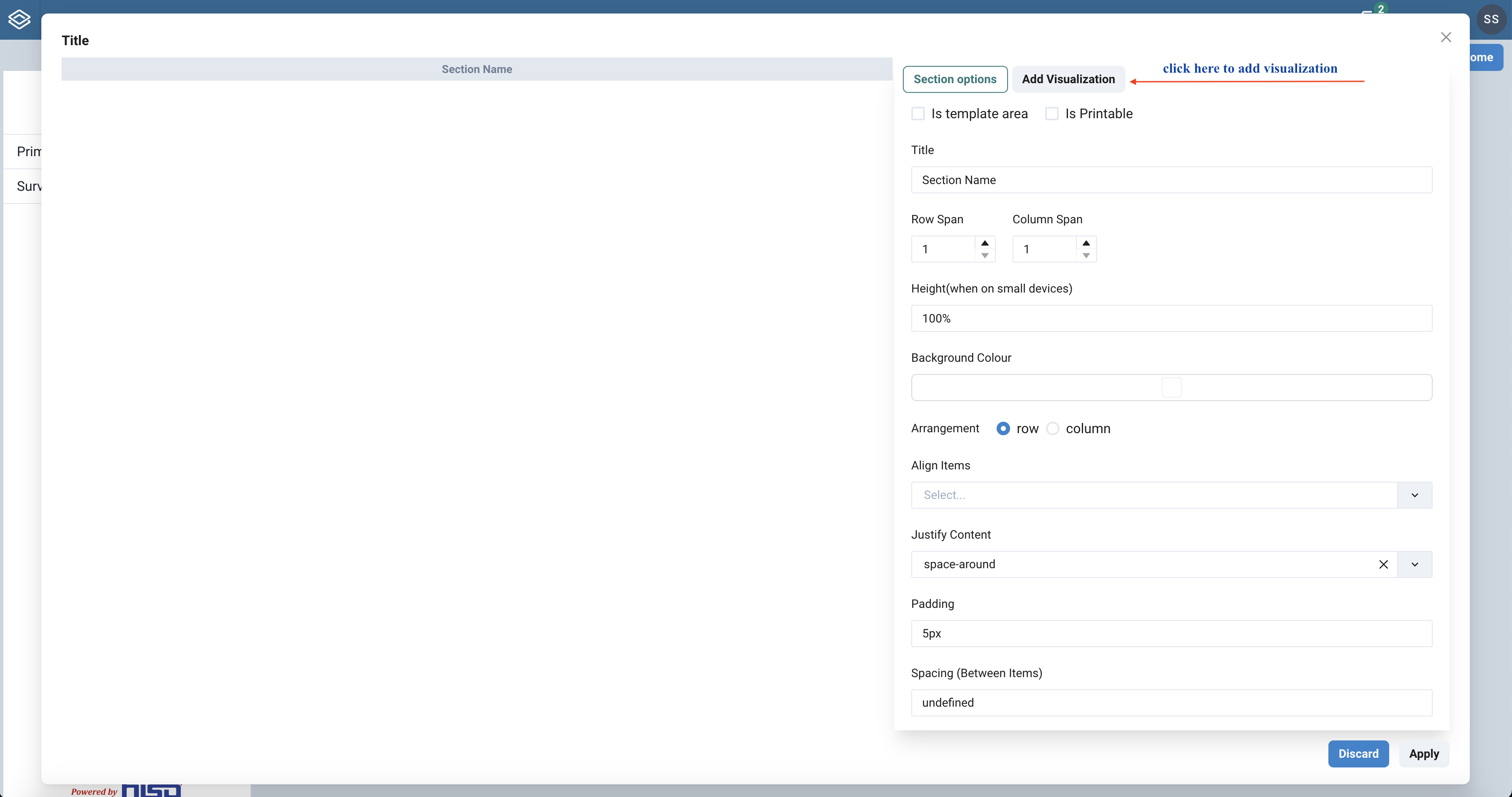
Clicking the Add Section button leads to modal to use when creating your section. In that modal, you have two panes, one to the left, and the other to the right. The right pane has a form where you specify the properties that define your section. In the left pane, you will see the section taking shape as you keep specifying the properties.
 |
|---|
| New Section Modal |
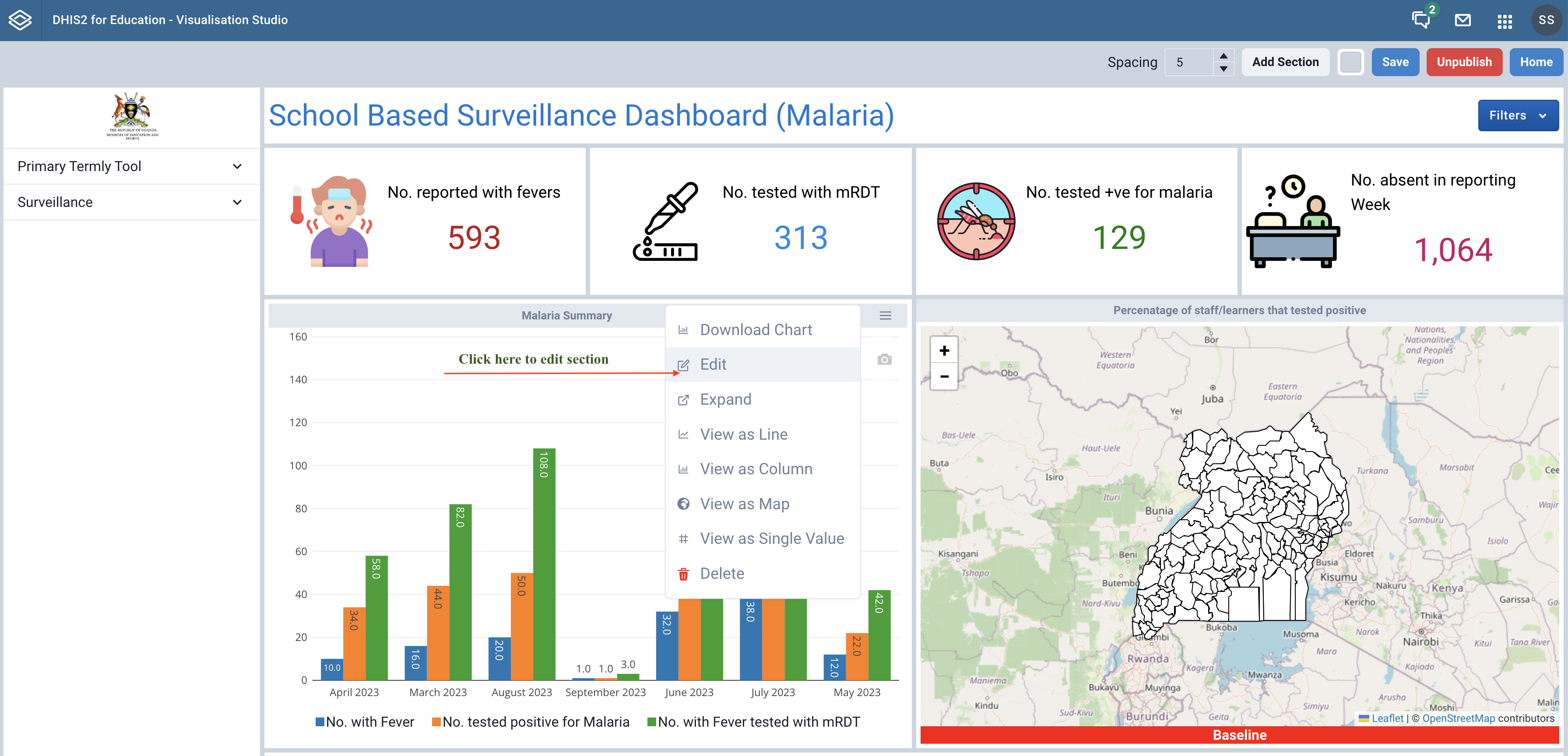
While still in edit-mode of your dashboard, navigate to the section you intend to modify and click the menu icon that is shown at the top right of the section upon hover. For sections without a title, simply double-click the section in order edit the section.
 |
|---|
| Accessing menu to edit a section |
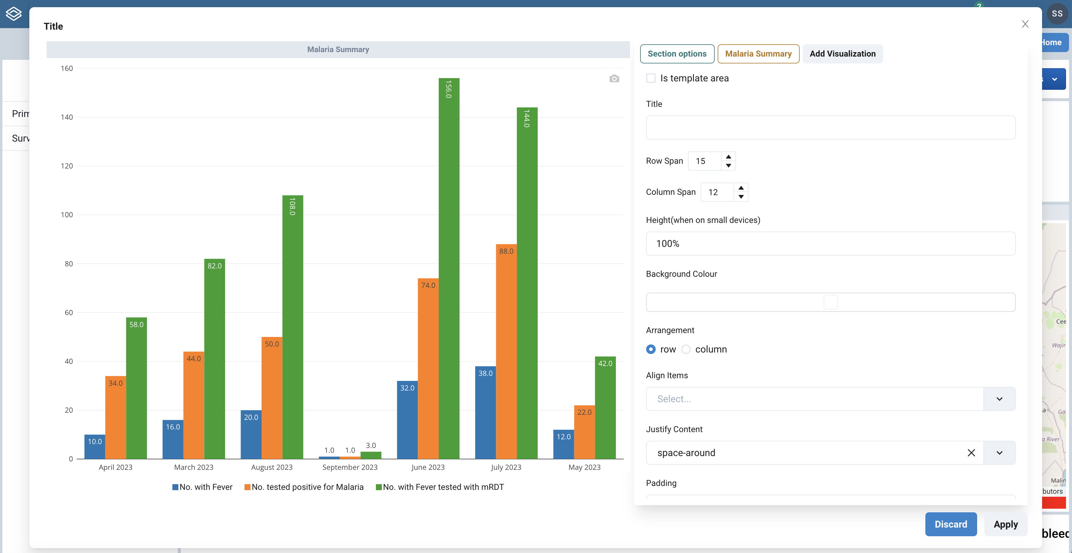
This should bring up a modal similar to that used when creating the section. Make the necessary changes by changing section properties in the right pane of the modal.
 |
|---|
| Editing a section |
If the section already has some visualisatoin items added to it, you will see buttons to the right of the Section options button that you can use to change the visualisation properties. More on this in the visualisation items section.
| Option | Description | Default |
|---|---|---|
| Is Template area | If ticked, is Template area makes the section hold a dashboard as its item. Can be useful for a dashbord template you want to appear on all dashboards. For example, a menu dashboard is a good fit for this. |
|
| Title | The title for the section when displayed on the dashboard | Section Name |
| Row span | The number of rows consumed by the section on a fixed dashboard | 1 |
| Column span | The number of columns consumed by the section on a fixed dashboard | 1 |
| Height | The height (percentage) to used when on small devices | 100% |
| Background color | The background color of the section. Can be chosen from a color palette | White |
| Arrangement | The arrangement defines how visualisations are stacked in the section. Row and Column represent horizontal and vertical arrangement respectively | Row |
| Align Items | Refers to how items are aligned in the section. center | end | flex-end | flex-start | normal | stretch | start | baseline | self-end | self-start |
|
| Justify content | Refers to how the section items are justified. center | end | start | strech | space-evenly | space-between | space-around | flext-start | flex-end |
|
| Padding | The padding applied to the items in the section | 5px |
| Spacing (Between items) | Refers to the spacing in between the items in the section. | |
| Display style | Refers to how elements are displayed within the section. Corousel for slide show, Marque for scrolling items, Grid fits items in a grid, Normal for default display | Normal |
¶ Visualisation items
The visual items we add to the sections on our dashboard are what is refered to as visualisation items. By design, we can add more than one visualisation item to a single section on your dashboard. In this section, we shall refer to a visualization item as a visualization.
Visualizations can only be created, modified or deleted while your dashboard is in edit mode and within the section editing modal.
A visualisation can be added by clicking the Add Visualization button at the top-right of the section modal that shows up when you are creating or modifying a section.
 |
|---|
| Adding a visualization |
A form to capture the visualization's properties will be presented in the right pane of the modal.
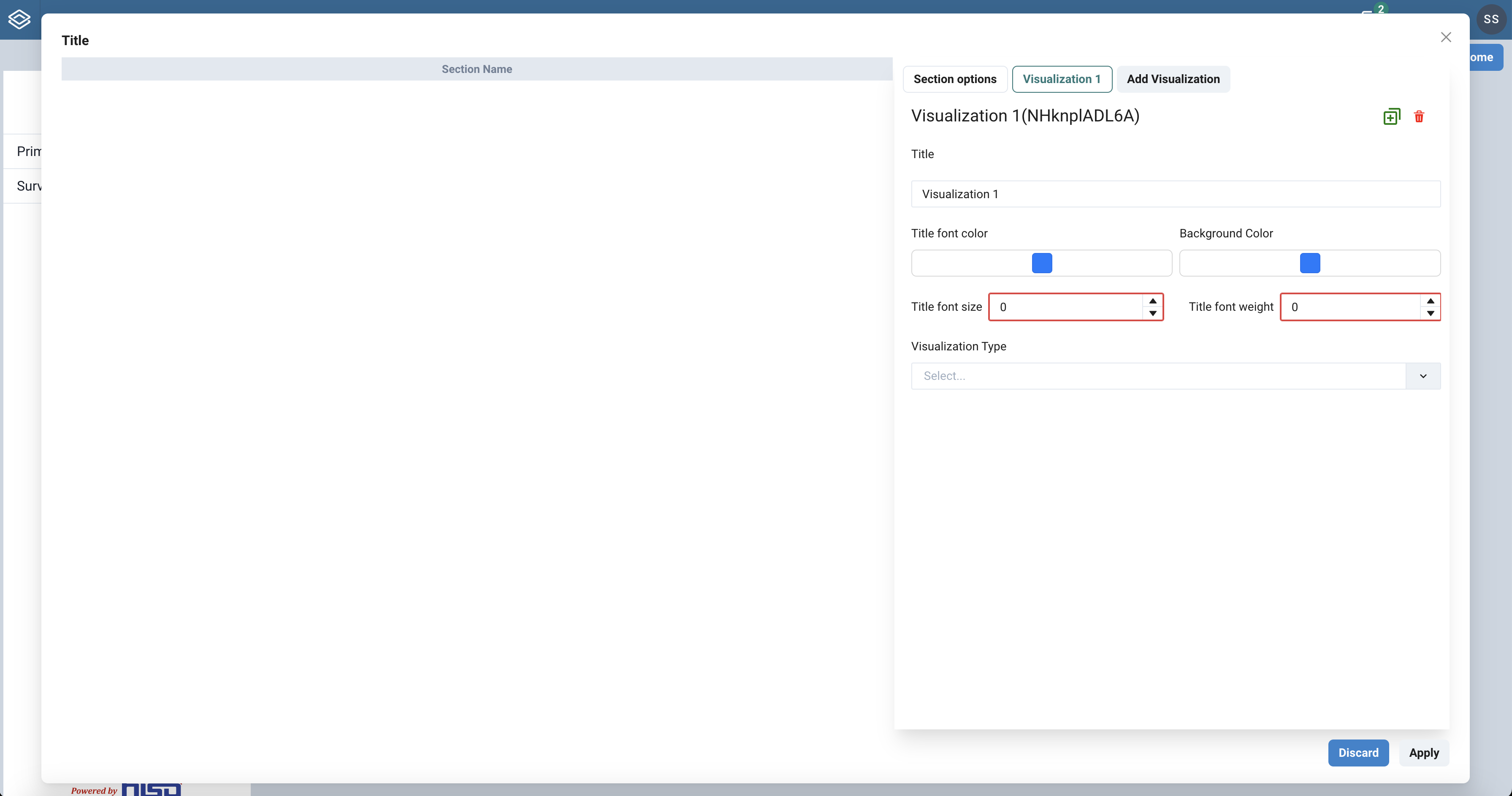 |
|---|
| New visualization form |
When you assign a title to a visualization, a button to use for modifying it will be automatically added at the top of the right pane. A default title is assigned and should change as you modify it in the form.
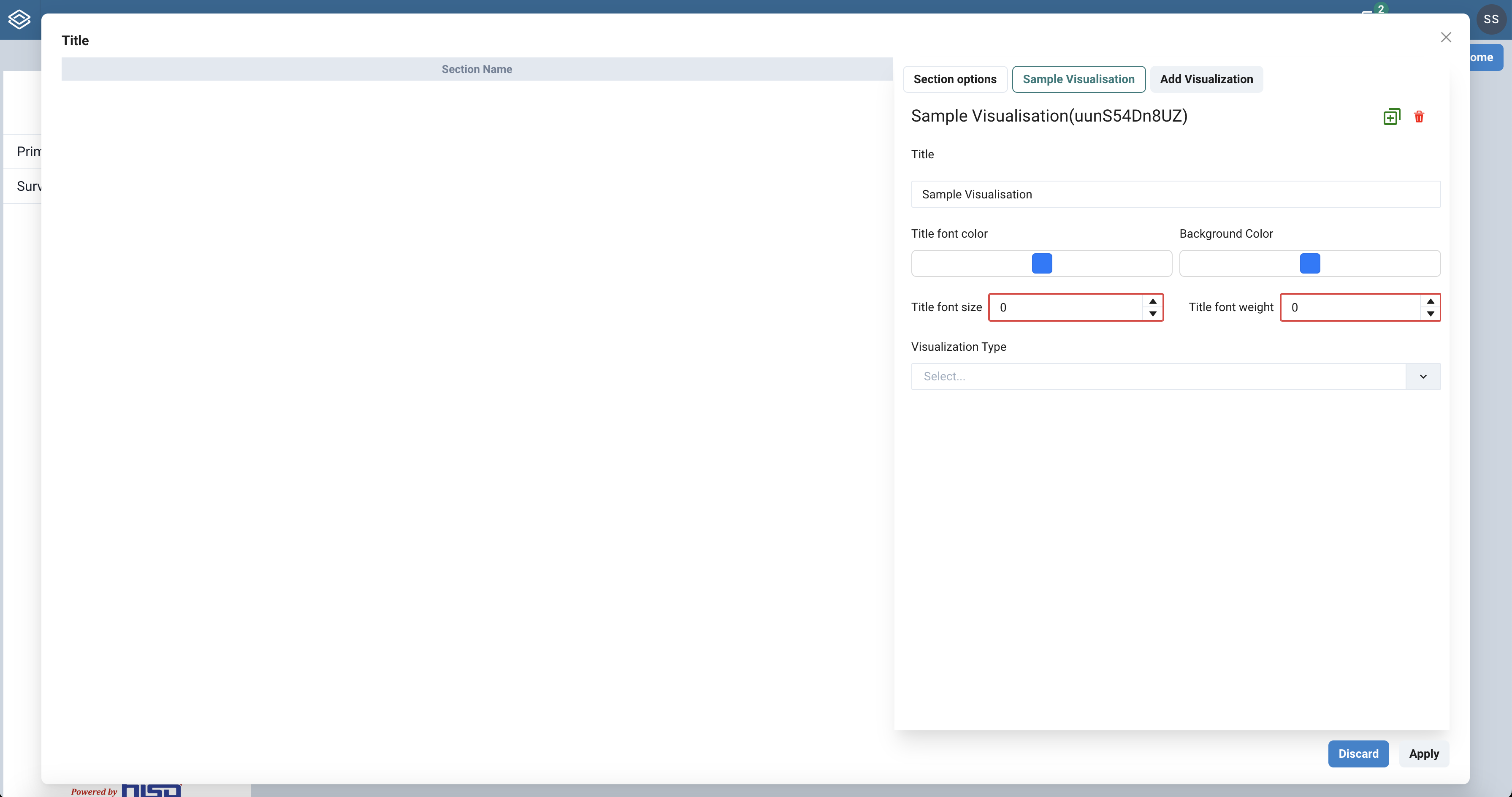 |
|---|
| Visualization title reflects in the visualization's button link |
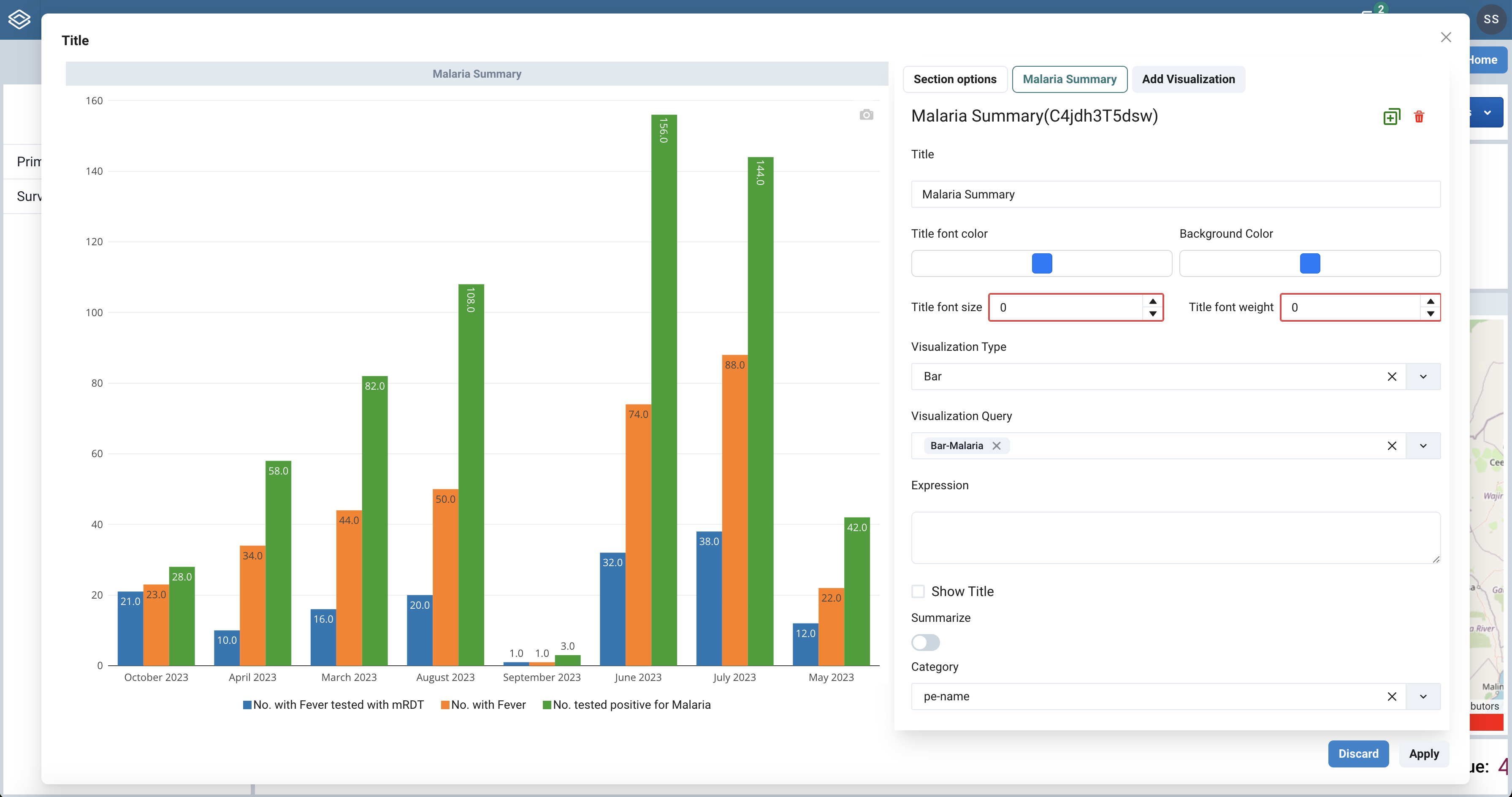
Adjust the visualisation properties using the form and hit the Apply button at the bottom right to persist the changes. As you change the properties, you should see the visualization change in the left pane of the modal that is used for preview purposes.
One of the key properties of a visualization is its type. When you specify the Visualisation Type property - which is usually a chart type, additional properties corresponding to the chart type are added to the form.
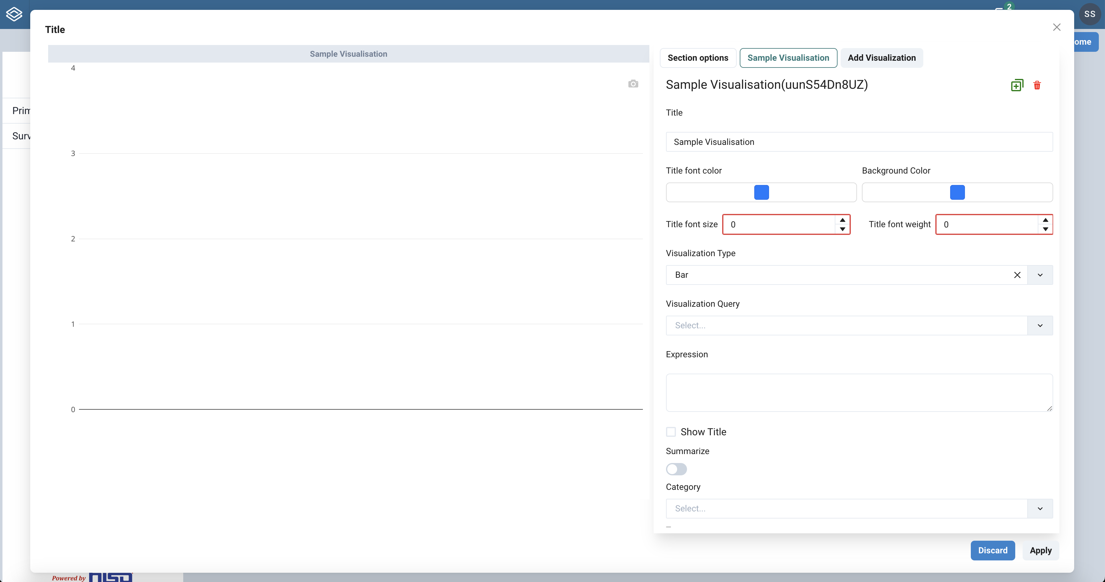 |
|---|
| New visualization of type Bar |
In order to have a meaningful visualization displayed in the preview pane, you have to specify a Visualization Query that informs the visualisation.
See the visualization properties for a detailed description of the visualisation properties that you have to specify for a visualization.
To modify a visualization, you will have to click a button with the name of the visualisation in the top-right of the section modal that shows up when you are creating or modifying a section.
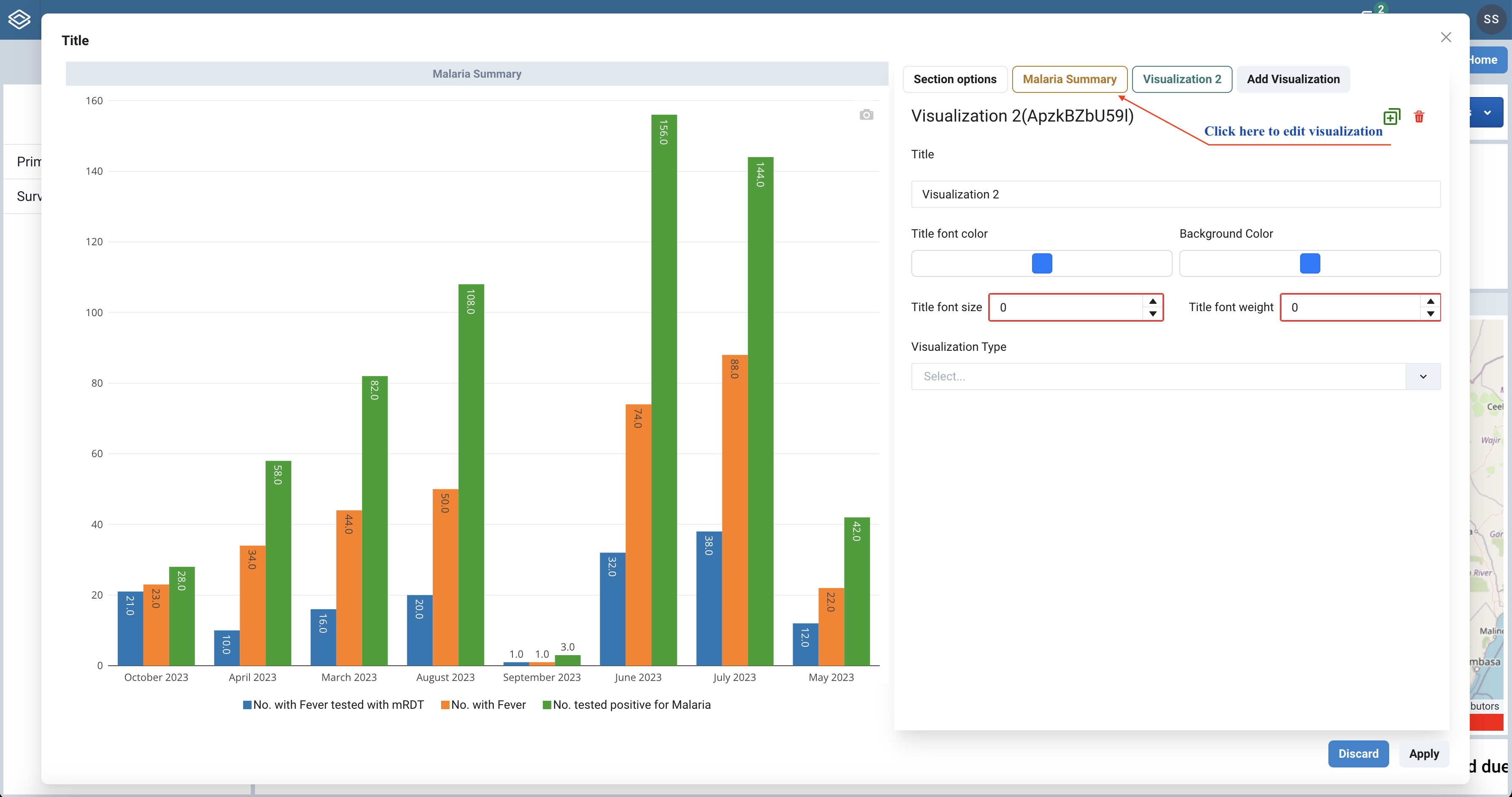 |
|---|
| Click visualization name button to edit |
The contents of the right pane of the section modal will change to a form with properties that define your visualization. Make the necessary changes to the visualization properties in the form presented.
 |
|---|
| Edit visualization form |
Once you have changed the properties for the visualization, click the Apply button at the bottom-right of the modal.
To delete a visualisation, you navigate to a delete icon that shows up at the top-right of the right pane of the section modal when you click the button with the name corresponding to the visualization you want to delete.
¶ Modifying dashboards
To modify a dashboard, go to the list of dashboards on the Dashboards page and navigate to the dashobard you want to modify. In the actions column of the listing, click the Edit button to activate edit mode for the dashboard. The screenshot below shows a sample dashboard in edit mode.
 |
|---|
| A sample dashboard in edit mode |
To change the dashboard properties, click the Save button
¶ Deleting a dashboards
To delete a dashboard, go to the list of dashboards on the Dashboards page and navigate to the dashobard you want to delete. In the actions column of the listing, click the Delete button and this should prompt you for a No or Yes confirmation. Clicking Yes in the prompt will result in a complete removal of the dashboard.
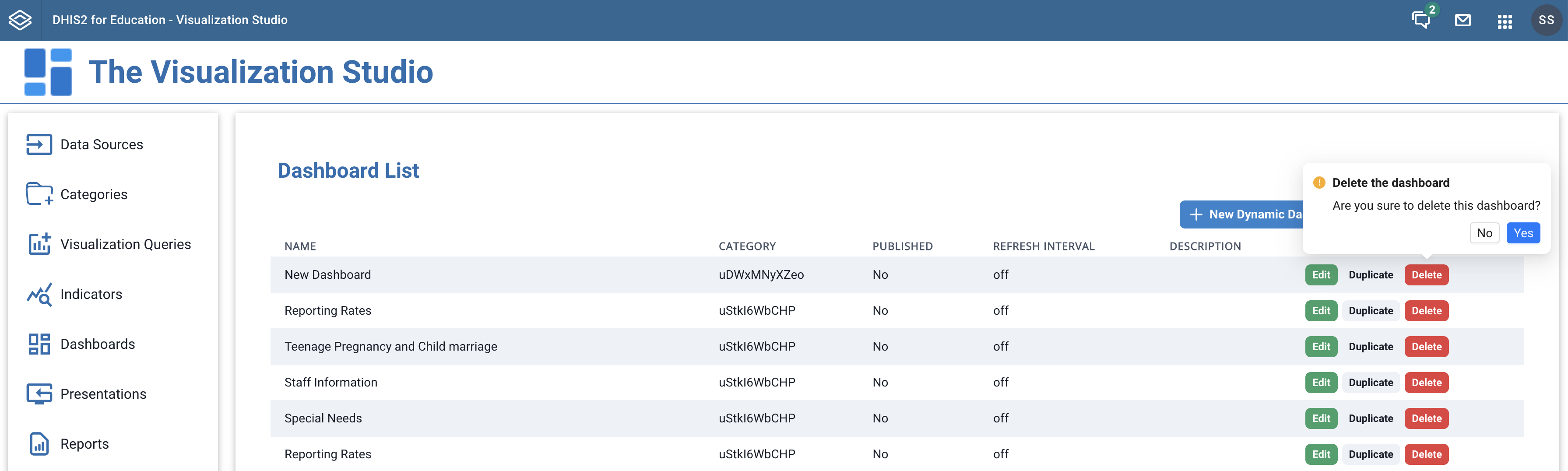 |
|---|
| Deleting a dashboard |
¶ Publishing a dashboard
Once you are done with creating a dashboard and have added sections with visualisations that suit the design you intended, you are then at a point where you want other users to see the dashboard you have created. To activate this, you have to publish the dashboard by clicking the Publish button at the top right of your dashboard while in edit mode.
Once a dashboard is published, it can be unplished. While in edit mode, a published dashboard will show an Unpublish button to click if you do not want other dashboard users to see the dashboard.
¶ Supported Visualisations
The Visualisation Studio currently supports the following Visualisation types:
- Column
- Stacked Column,
- Bar
- Stacked Bar,
- Line
- Pie
- Gauge
- Single Value
- Pivot table.
- Text
- Image
- Dashboard Filter
- Dashboard List
- Dashboard Tree
- Divider
¶ Filtering
¶ Steps to Create a Dashboard
- Define a data source
- Define Categories
- Define visualisation queries
- Define indicators from the visualisation queries
- Plan your dashboard layout
- Fixed layout vs. Dynamic layout
- Create a dashboard
- Add sections to your dashboard
- To each section add one or more visualisations
- Modify the properties of your visualisations to customise their look and feel.
- Publish the dashboard